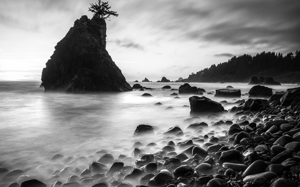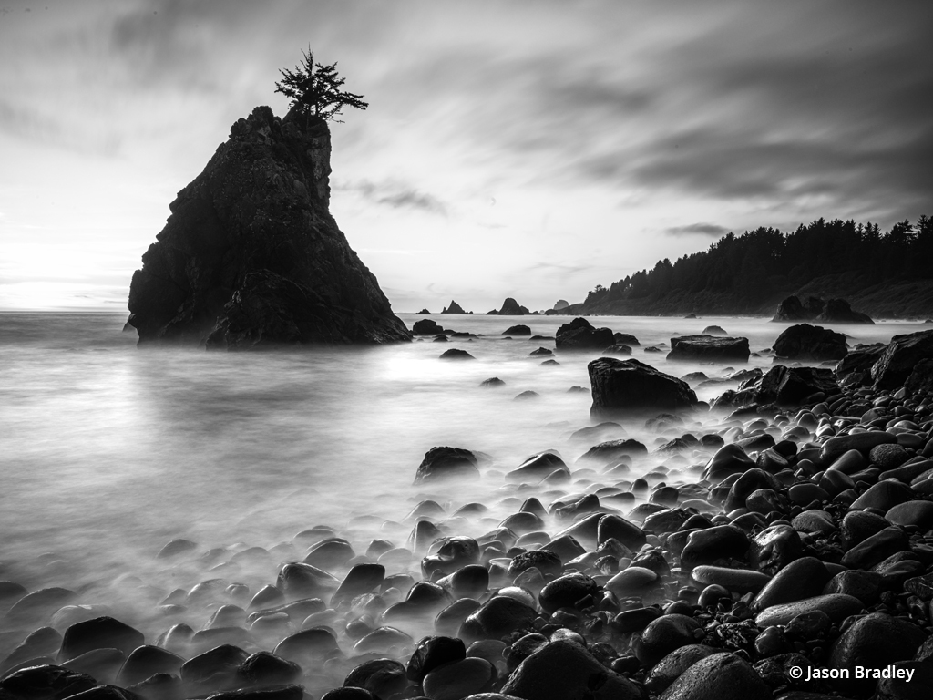
Figure 1. The black-and-white print requires vision, technique and, more than anything else, practice.
Black-and-white printing is an art unto itself. There’s a lot to consider, both creatively and technically. Without color to lean on, we must put more thought into how we render our image’s textures, patterns and contrast. We might need to dodge and burn to direct the viewer’s attention either toward or away from certain parts of our composition. We want to know which paper or other medium will best express our vision. We must calibrate our monitors and consider the use of profiles.
Like with any craft, we practice and pay our dues through trial and error as we get familiar with what works and what doesn’t in order to master the black-and-white print. There’s no way around it; you can’t just read an article like this and walk away making perfect prints. I’ll do my best to make things easier, though, as I have a bit of experience printing for myself and for others.
For over 15 years now, I’ve been teaching digital workflow. In that time, I’ve grown to be a firm believer that printing is one of the most important—if not the most important—phases of a photographer’s workflow.
There are so many reasons why printing matters. I’ve witnessed that the photographers who regularly make prints look more critically through their bodies of work than the photographers who simply intend to post low-resolution versions of their images on social media. Photographers who print consider consistency in style and how images will exhibit together. They pay closer attention to how the details render, if sharpness is perfectly applied, if noise is distracting and if chromatic aberration needs to be removed (which can still be an issue for black-and-white imagery).
Photographers who print have at their fingertips a feedback loop about their technical abilities that other photographers do not. Thus, those who print tend to evolve faster technically. I believe that printing is so important to a photographer’s workflow and growth that I started Bradley Print Services, and for over eight years now, I’ve been printing for other photographers, helping them curate their work, developing their images and making the best prints and portfolios possible. This puts me in the unique position to share with you what I think are the top five things to know when it comes to black-and-white printing techniques.
1. Choosing The Right Starting Point

Figure 2. Before starting any black-and-white development, try looking first to what your Profile Browser has to offer.
With RAW file workflow, and especially black-and-white RAW file workflow, the success of one’s developments is often determined by the starting point. By this, I mean that it’s not uncommon for a photographer to fully develop their image as a color photograph and then convert that developed image to black-and-white as an afterthought. My first suggestion: Start from the beginning. If you have already developed for color, most often it helps to reset your development and start over when developing for black-and-white.
My process for black-and-white developing is very different from how I develop color images. I can push contrast, shadows and highlight detail in all sorts of directions in black-and-white that I can’t in color. In fact, color often constrains what I can do in these areas because it is so easy for people to pick up on colors that aren’t natural. I’ve found that if I develop in color first when my goal is a black-and-white image, it sets me back.
Where should you start? In Lightroom Classic (assuming that’s your tool of choice), look to the Profile Browser found in the Develop module’s Basic panel. At the top of the panel under Treatment, you’ll find Profile. Click on the small four-squared icon on the right to open the Profile Browser. There, you have 17 different black-and-white profiles from which to choose (see Figure 2). Some are simply numbered B&W 01 or B&W 02, while others simulate the use of color filters and are named things like B&W Green Filter, B&W Red Filter and so on. Starting with a profile that is close to the look you want makes the process much faster.
Beyond your starting point, it’s sometimes challenging to know where you can go stylistically with an image or a set of images. In this case, I suggest you explore the Presets panel in the Develop Module (Figure 3).
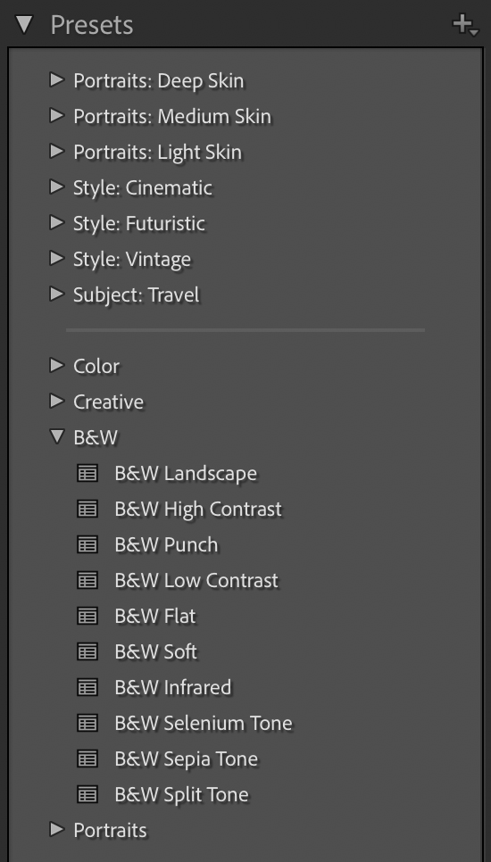
Figure 3. After choosing the right black-and-white profile, explore the Presets panel for a few creative possibilities.
Presets are a different kind of “starting point.” Beyond a more basic Profile, a Preset is a saved developmental configuration. Meaning, you can move the sliders around in the Develop module’s Basic panel, create a look that you like and want to repeat, and then save that configuration as your own Preset. (To do so, simply hit the + symbol at the top of the Presets panel once you’ve made your adjustments and name your preset.)
The Presets panel includes several pre-configured presets offering a slew of developmental ideas. Look for the B&W section shown in Figure 3 to find 10 different black-and-white possibilities. Beyond these, there is an abundance of presets that you can find and download on the web. Most of what you find costs a bit of money, but they might be a great way to fuel new ideas. Personally, I suggest saving a bunch of your own presets as you go. Doing so will help the creative possibilities flow from you, which I think is invaluable.
2. Lightroom’s Black & White Panel
After you’ve settled on a starting point for your development, you can begin to fine tune it. Even though there are many paths to fine tuning, the B&W panel offers a lot of creative control.
Don’t let the color sliders in the B&W panel fool you. You’re adjusting a monochrome image, but it still has all its color information, and this is what’s used to manipulate your image’s tonality after it’s converted to black-and-white.
There are a couple ways to approach the panel. You can simply move the sliders back and forth with each individual color panel. Or you can use the TAT tool. The TAT tool, or Targeted Adjustment Tool, can be found in the upper left corner of the B&W panel (see Figure 4). Simply click on the TAT icon, and your cursor turns into a crosshair.
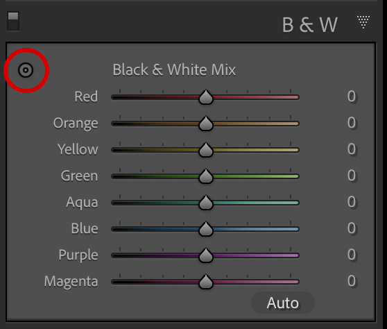
Figure 4. In the B&W panel, try using the Targeted Adjustment Tool (TAT) to shift tones in your image. You’ll find it more effective than moving one color slider at a time.
Then look for a tone on your image that you want to darken or lighten. To darken a tone, click on the tone and drag your mouse down. To lighten, click and drag up. Figures 5A, B and C below show the result of different adjustments.
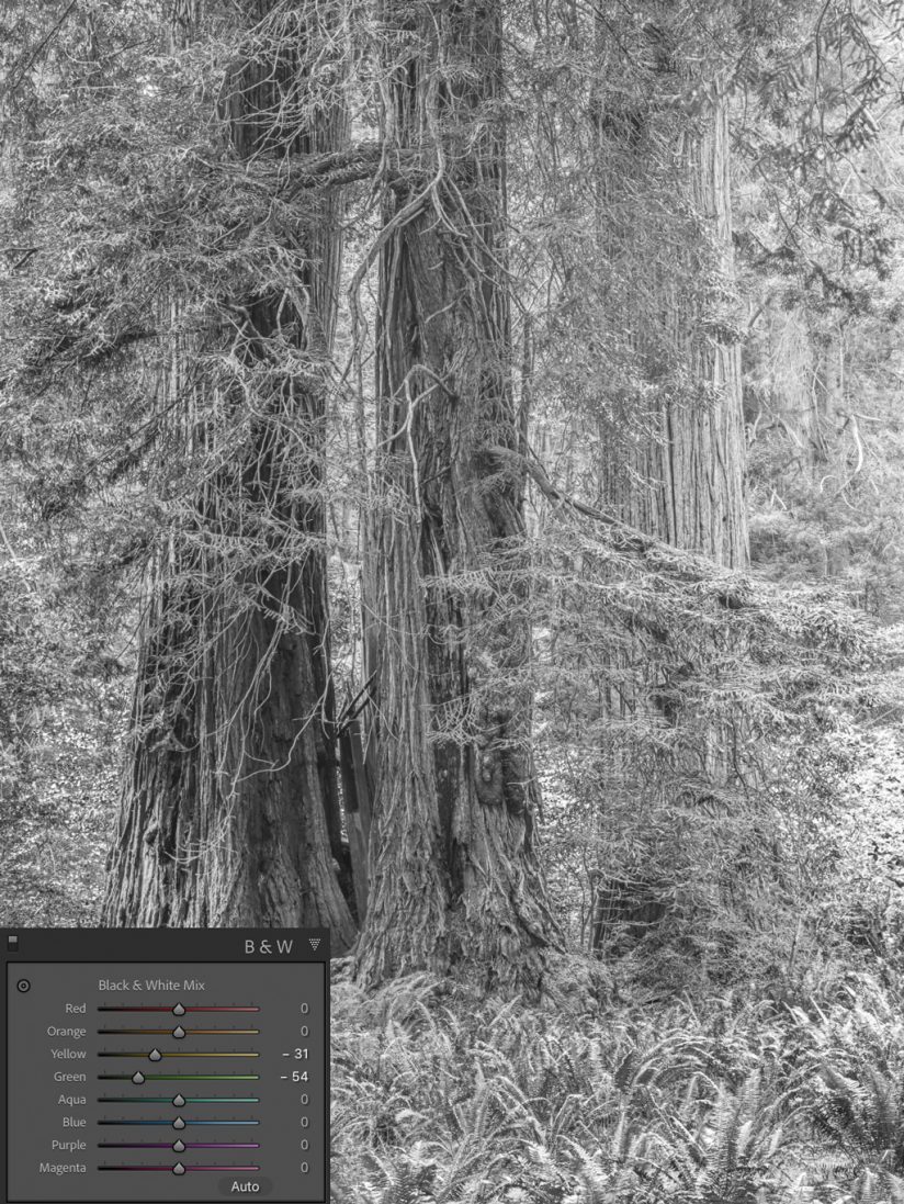
Figure 5A. Yellow and green channels are darkened.
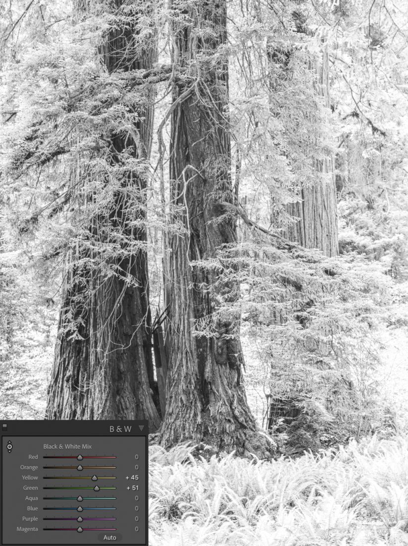
Figure 5B. Yellow and green channels are brightened.
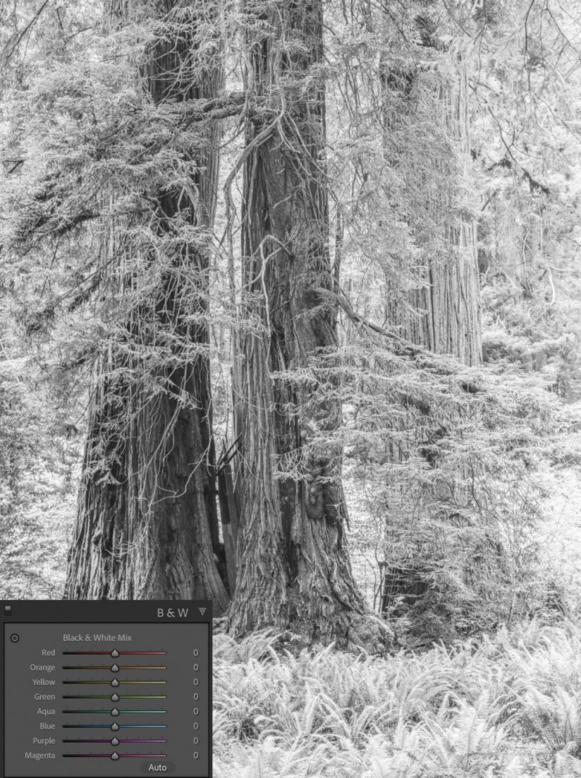
Figure 5C. No adjustment to yellow and green channels.
I recommend the TAT tool because usually the colors in your image are actually a mix of different colors. You’ll find that when using the TAT tool, it often moves more than one slider. Moving one slider at a time is not only less efficient, but it can also create some unsightly tonal separation artifacts.
Pro Tip: You can also shift the tones of your black-and-white images by playing with the White Balance sliders in the Basic panel. Try moving them around to see how it’s affecting your highlights and shadows.
3. Toning Your Black & White Images
Look toward the Color Grading panel to tone your black-and-white images. You can create warm tone or sepia tone effects, cool tone or cyanotype effects, or you can do split toning. In case you haven’t upgraded Lightroom Classic recently, toning used to be performed with the Split Toning panel, but that was recently replaced with the Color Grading panel, which offers much more control when needed.
Here’s how to create a sepia-like effect. At the top of the Color Grading panel, you’ll see Adjust followed by a series of circle icons (see Figure 6). The first icon of three little circles allows you to see a color wheel for your shadows, midtones and highlights. The next three circles take you through the shadows, midtones and highlights individually, and the final circle allows you to adjust the color globally. The global adjustment is the one you want. Simply change the Hue to 35 and move the Saturation slider up to taste. The Luminance slider just lightens or darkens the image’s luminance values.
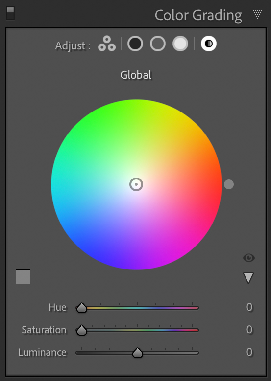
Figure 6. In the Color Grading panel, you can target your shadows, midtones and highlights separately or globally.
Cool toning an image isn’t much different. Change the Hue slider to 220 and move the Saturation slider to taste. Figures 7A and B below show both the warm and cool toning effects I described.
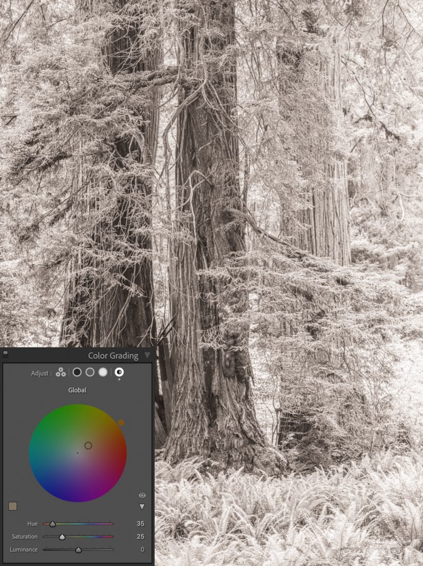
Figure 7A. Warm toning.
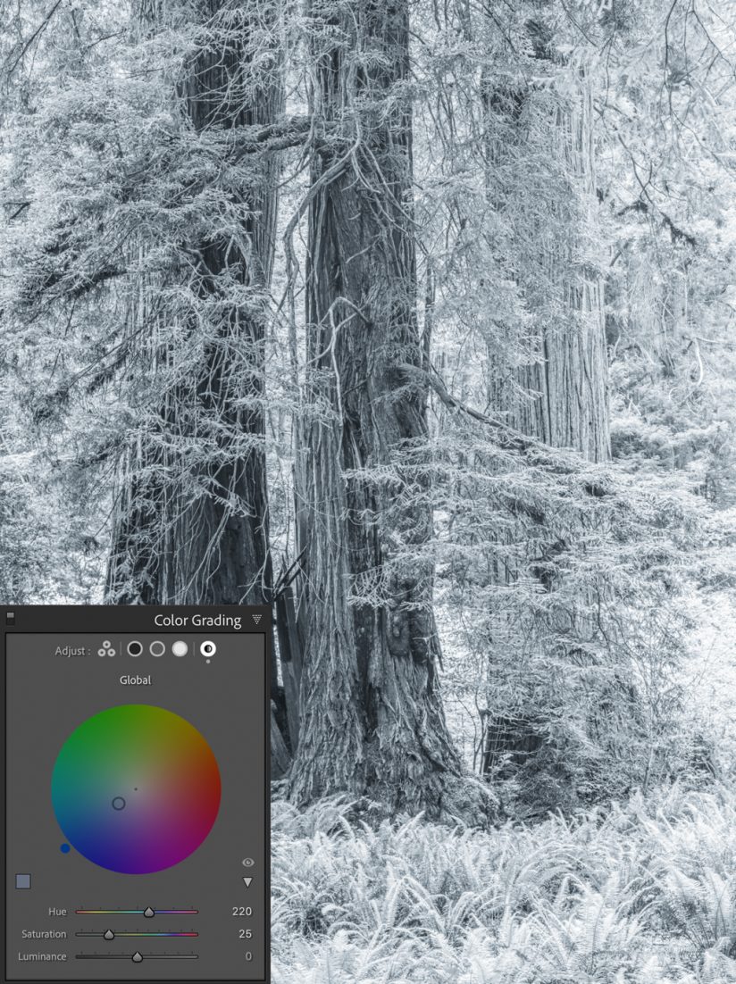
Figure 7B. Cool toning.
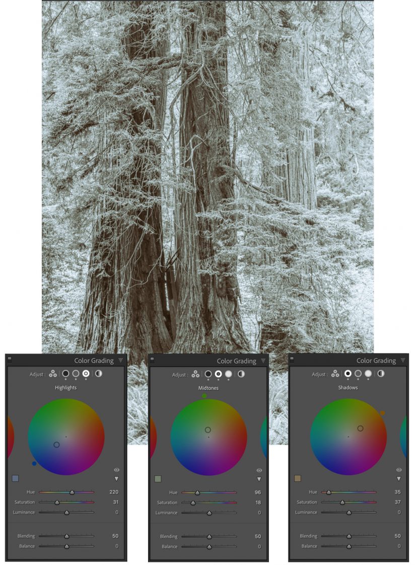
Figure 7C. Split toning with different adjustments for highlights, midtones and shadows.
4. When To Use (And Not Use) Color Profiles
Using color profiles is an essential part of creating consistency in digital color printing. More specifically, we must adhere to principles in ICC color management to help ensure that the image you’ve developed on your display translates accurately to your final print.
The trick is to use ICC color profiles with everything along your workflow device chain. Your monitor should be calibrated and displaying colors with an ICC profile. You should use profiles made for the specific printer you’re using as well as the specific paper you’re running through it. You’ll notice that the key term here is ICC “color” profile. Since we’re talking about making black-and-white prints, this doesn’t always apply.
Whenever a client orders a black-and-white print, I don’t use any color profiles, and ICC workflow is of no use. Instead, I turn off color management and turn on my print driver’s black-and-white mode. This turns off the color ink cartridges and uses only the black and gray inks to do the work.
This is such an important trick to printing in black-and-white. If you use your normal printing workflow and ICC color profiles, some color inks will likely be used—even if all the color has been removed from your image during development. This could add an unwanted toning effect and even metameric failure if the print is viewed at certain angles. So, again, turn off the color to keep your black-and-whites neutral.
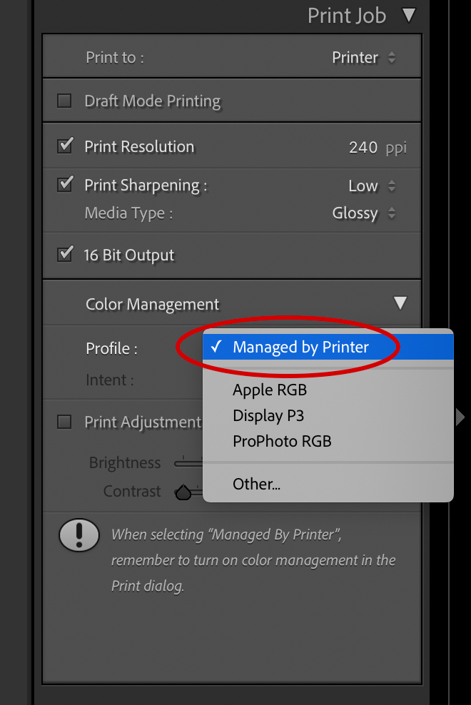
Figure 8. When printing in black-and-white, turn off your color inks by letting your printer manage color.
To turn off Color Management in Lightroom, look at the Print Job panel in the Print module in Lightroom Classic (other programs have this feature as well). About halfway down the panel, you’ll see Color Management, and just below that, you’ll see Profile (see Figure 8). Click and select Managed by Printer. Then refer to your printer’s manual to learn how to select its black-and-white mode. We use Epson printers at Bradley Print Services, so I choose Epson’s Advanced B&W Photo mode in the Print dialogue, as shown in Figure 9.
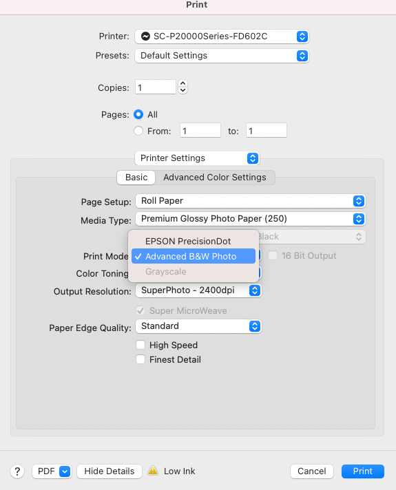
Figure 9. Most printers have a black-and-white mode that uses only the printer’s black and gray inks. With my Epson driver shown here, I select Advanced B&W Photo mode.
What if you color-toned your monochrome image? In that case, you should not turn off color management. When printing color-toned images, instead of selecting Managed by Printer in the Print Job panel, select the color profile for your printer and paper you’re using.
Digital printing is complicated, and I may have confused some of you more than I’ve helped when talking about “ICC stuff” and “color profile whatever.” But no matter who makes your prints, understanding how ICC color management works is extremely important, and I encourage you to learn more. Check out the four-part article series “Modern Printmaking” I wrote for Outdoor Photographer a few years ago at outdoorphotographer.com. It elaborates on color profiles and ICC color management and covers other printing topics in more depth.
5. Know Your Papers For B&W Printing
Papers are often overlooked by photographers, surprisingly. Your choice of paper can help define the style of your work as much as other critical choices you make, like whether to present your work in color versus black-and-white. Printing a well-executed and well-developed black-and-white image on a lovely fine-art cotton paper versus a cheap paper that the local drug store carries sends a signal to your audience. With all the effort you put into your craft, I suggest you spend the time looking for the right paper that best represents who you are as an artist and your vision for your work.
Where do you begin? You can start in one of a couple places. If you’re printing at home, buy paper sample packs. Most manufacturers sell them just so photographers can get a feel for what the options are. In addition to the premium papers offered by your printer manufacturer, some of the paper makers I suggest trying are Hahnemühle, Canson, Moab and Ilford.
If you don’t print at home and want to work with a lab, ask if they provide paper samples. I offer my clients a paper sample packet for a nominal charge. You can send us a file that we will print on five different papers, so you can see how that image translates with each.
YOU MIGHT ALSO LIKE
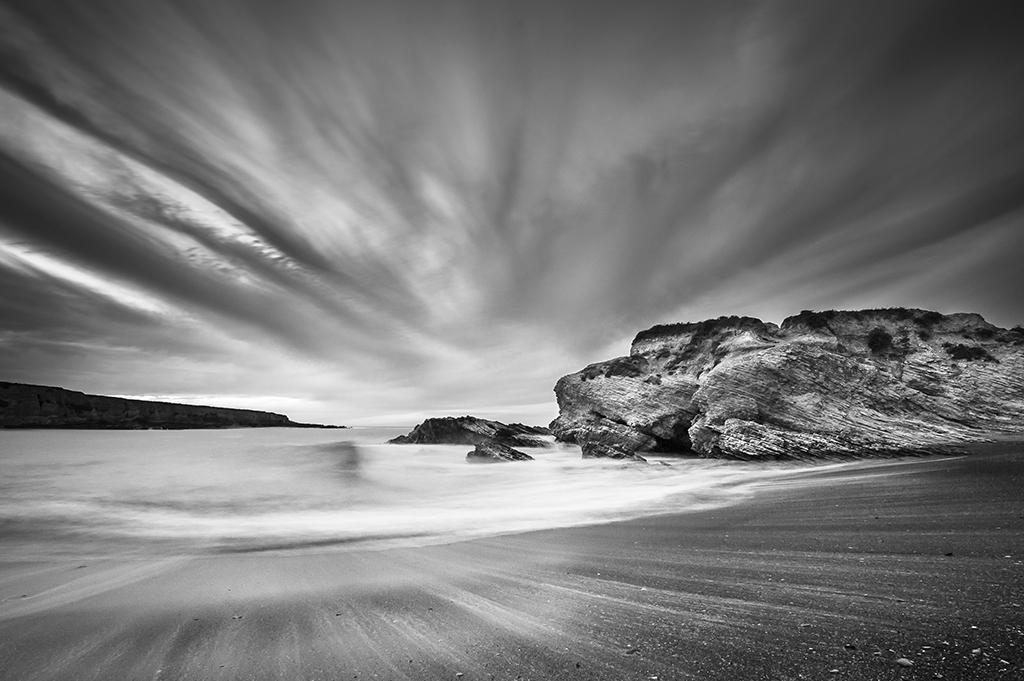
Converting To B&W In Lightroom
Explore the Profile Browser in Lightroom Classic and take a playful approach to black-and-white workflow. Read now.
Whichever path you choose, there are a few things I suggest you consider when looking at a paper. Is the paper glossy, semigloss or matte in finish? Is it thick and heavy or thin and flimsy? Is the surface of the paper smooth, rough or textured? Does the paper feel heavy or light? From what is the paper made? Some papers are made from alpha cellulose (various plant fibers), and some are made with 100 percent cotton (which is the preference of many fine-art photographers). Other papers are made with a mix of materials. Hahnemühle, for example, has a new Natural Line of papers that combines different percentages of cotton and alpha cellulose with hemp, bamboo or agave.
There is a lot to consider in finding the right paper, and you won’t know which one is right for you until you see your work on them, hold them and even smell them. Some papers will feel elegant and others cheap. It’s a totally subjective thing. All I want you to do is distinguish between what’s refined and elegant versus what’s cheap and unmemorable.
Personally, I love printing my black-and-white imagery on cotton rag paper, specifically the highly regarded Hahnemühle Photo Rag 308. Monochrome imagery looks lovely on it. Others I suggest you try include Canson Platine Fibre Rag, Hahnemühle Photo Rag Baryta and Moab Entrada Rag. All are excellent choices.
Practice, Practice, Practice
Though I hope these tips are helpful—and even if I gave you another five or 10 more—nothing can replace the time you put into the practice of making prints. Whether you print at home or with a lab, start printing and then print some more. It will help you grow as an artist. It will offer you a deeper understanding of your technical abilities. As you gather more and more prints, it will begin to show you how your work fits together stylistically or thematically. The closer you are to achieving that insight, the closer you are to showing your work and exhibiting.
The post 5 Tips To Master B&W Printing appeared first on Outdoor Photographer.

