Making images that appeal to collectors and photographic prints that sell well is the goal of many nature photographers to share their craft, earn an income and get a return on investment for the gear, time and travel that this passion requires. Yet for the vast majority of photographers, even the most impactful, contest-winning types of images often sit unsold when they are mounted and offered for sale. Why are many of the very best images out there unsellable—especially when photographers frequently hear fans say their images are good enough to be sold?
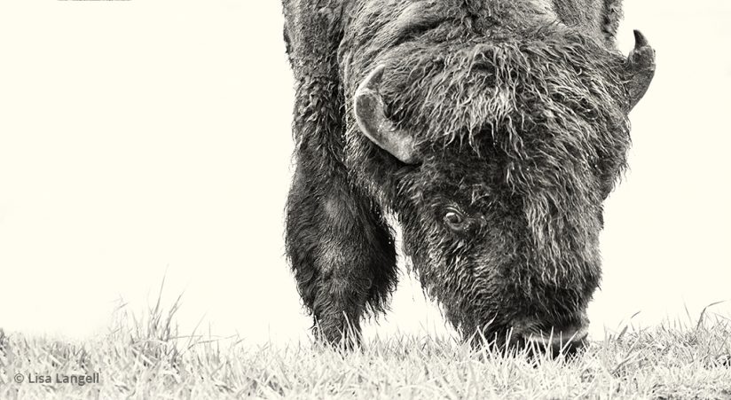
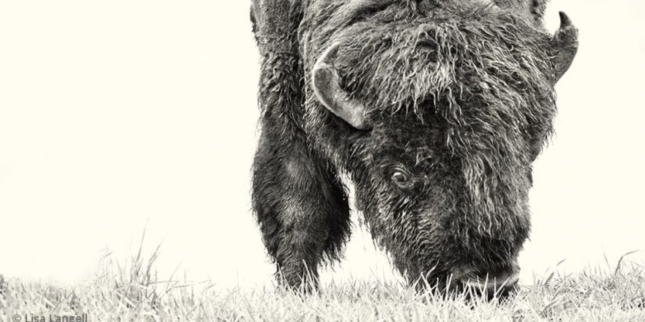
High-key techniques can be a good choice for prints that sell to interior designers and collectors. To make this photograph of a bison, I was positioned low to the ground and composed the shot so that nothing but the foreground and the lake reflecting the gray skies was in the frame. The image was 2.3 stops overexposed. Spot metering can help more easily obtain the proper exposure for this look, but over-exposing may still be required.
Veterans in the field often feel the market for nature photography as art is minimal. This is not because nature as décor has become out-of-vogue. In fact, incorporating elements of nature continues to be on-trend for 2020 among numerous interior design-related references touting what is hot—and not.
The Mindset Of Interior Design
One important reason for sluggish print sales may not lie in image quality but rather in how photographers misperceive the rules of engagement to sell in today’s market.
Many photographers shoot impressive, high-quality images that could easily grace the cover of this and other publications, images that are intense, vivid and impactful, like bears catching salmon, a scarlet macaw in flight or a colorful landscape filled with flowers and a rainbow. Yet if you asked interior decorators which of those photographs they would choose, they will likely pass on them all. The color palette, amount of negative space and potential for the photograph to be incorporated into the décor of the entire room makes most nature and wildlife images incompatible. These images tend to be shot in “classic ways” that traditionally adhere to well-established rules familiar to most seasoned photographers that qualify them for contests, magazines and calendars. Yet they are often 180 degrees from the criteria decorators use to stylize home or corporate interiors.
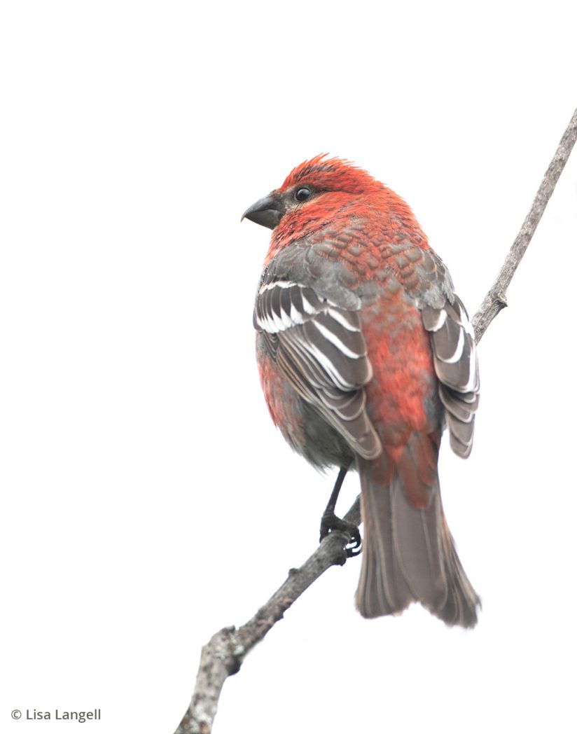
Pine grosbeak. Use backlighting and overexpose by one to three stops to blow out background.
For example, a relaxing design of a living room might incorporate a three-color palette of breezy whites and soft blues accented by a pop of yellow. The materials and colors used in the paint, furniture and accent pieces are chosen to support the design and visual flow of the room. Hanging an exquisite print of a bear catching a bloody salmon in his mouth over the sofa just isn’t going to work, no matter how technically superior the image. Even a peaceful landscape shot with fields of lilting yellow flowers is disqualified because of the additional colors it contains in the rocks, sky, greenery and more. Prints that sell well lend themselves to principles of interior design.
Prints That Sell: Shooting For The End Use
This then brings nature photographers to a fork in the road. Shoot for magazine and calendar-style work or shoot for interiors? If the latter is chosen, how is that accomplished? Most nature photography clubs, contests and critiques have helped us refine our techniques and style for the former. It is nearly unheard of to have a critique done on images of nature with the intent to give feedback from an interior decorating standpoint. Therefore, new knowledge and “rules of engagement” are necessary to understand key tenets of what tends to be more desirable for interior décor.
Photographers are used to thinking exclusively of how well their images are composed within the frame itself—not how well it will fit within the greater composition and décor of a room. A few questions may help reframe how we think about what we photograph:
- Is this image to be used as a focal piece versus an accent piece in a specific room?
- Does the room need a series of images that tie together, such as a triptych or gallery?
- What is the color palette of the room, and how can the image capture those colors or be post-processed to replicate those colors?
- Does the room’s design require images with expansive negative space to keep the room from feeling cluttered? Or does it perhaps require an intense, bold abstract pattern that is used as a statement piece on an otherwise empty wall in a lobby, for example?
- What is the mood of the room, and does the image support that mood?
Deep coverage of the criteria for interior artwork is beyond the scope of this article, but keeping the question “Where is this image going to live?” in mind before you shoot can help bring both inspiration and intention into your photography—regardless of if it may someday reside on a living room wall or magazine cover. When shooting artwork for interiors, try first perusing interior design articles and attend to what types of styles, colors and palettes are used in the artwork and décor within those designs. It will help inform your photography in the field.
What To Look For In The Field
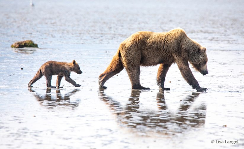
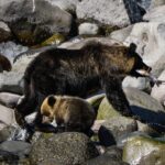
Before: Original capture of a coastal brown bear and cub.
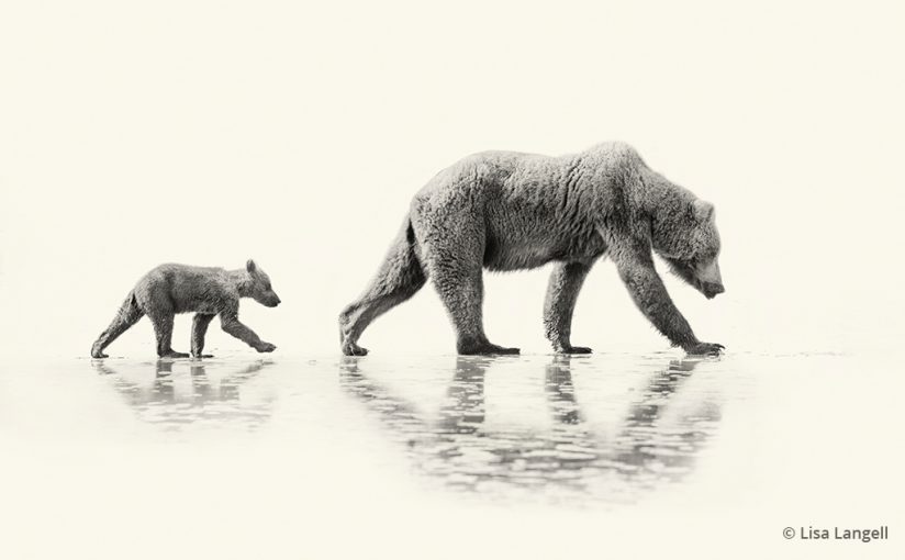
After: The final image of a coastal brown bear and cub after post-processing and sepia toning.
Many times, images with clean, simple compositions and very simple palettes of two to three colors will work best. Reviewing principles of color theory will also give photographers an advantage. Images utilizing high-key styles, negative space and strong but simple subjects are desirable by consumers. Avoiding graphic images of animals with prey or images with intense action is a good idea when shooting for residential settings, as most consumers want to create a peaceful ambiance in their home. Energized images are better suited for magazines than most interiors.
High-key photography, which contains unnaturally white or bright elements with a reduced contrast ratio, can be an exciting style to try as you build your portfolio for interiors. You can now utilize light that is typically viewed as terrible for capturing classic magazine-style images. Drab, overcast skies and backlit subjects are ideal for high-key shots. You can now maximize all daylight hours by using this technique and others listed below. Positioning strong subjects to be backlit—then over-exposing by one to three stops—will bring your subject to the correct level of exposure and blow out the sky or background, as shown in my image of a pine grosbeak.
It is also helpful to consider a subject’s background, working to ensure it is uncluttered and without objects that merge with your subject. My original capture of a coastal brown bear and cub shows how shooting a backlit subject on a sunny day, using a reflective, mid-toned mud flat as the background, can be blown out in the same way as a gray sky. Over-exposing the image to bring the subject into proper exposure washes out the mud flats. Even so, exposing to the point of clipping the ground was not quite possible without losing detail in the highlights on the topline of the bears. Thus, post-processing was used to finish the look, along with adding a sepia effect to make the image ideal for a rustic interior.
Processing The High-Key Look
When it comes to processing, forget about the traditional rules and restrictions around the minimal editing of nature images. Clients will not typically care if the image is post-processed in a way that makes it an outstanding fit for their home or office. They will be delighted that nature is brought into the interior and that it was created with contemporary taste and style in mind. Do the best job possible in-camera, then use masking, layers, exposure adjustments, adjustment brushes or other tools to finish the artistic vision. It is possible to honor the beauty of the subject yet still adhere to the guidelines of art that is desirable for interior décor.
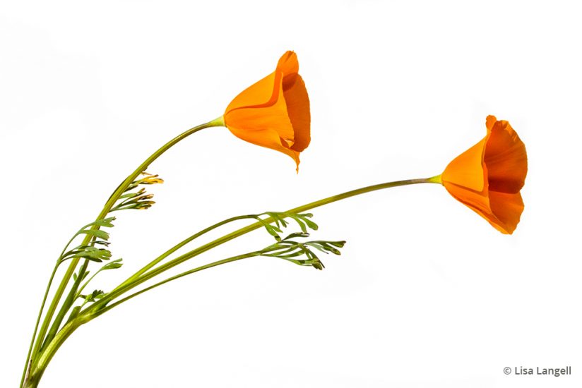
I used a piece of white foam core propped up behind the poppies to achieve the clean white background.
If drab, gray skies are ideal for high-key images, but you are shooting in weather with abundant sunshine, consider in-the-field alternatives that mimic what you could accomplish in a studio. My image of poppies was shot in the field, midday, with a piece of white foam core propped up behind the flowers. There are two ways to accomplish this shot:
- Position the sun so that it directly hits the board and flowers, but the angle of the board and/or your stance is shifted slightly until the strong shadows fall outside of your composition. This is the technique I used for my poppy image.
- Position the flowers directly between the sun and yourself. Face the sun and insert the white board behind the flowers, so they are shaded by board. Focus on the flowers, and then turn your histogram or highlight alert on. Over-expose by typically two to three stops.
In either approach, you will want to ensure you clip all the highlights around the flowers—but not so much that the RGB values in the flowers are clipped, or you will lose detail, a common problem when photographing bright colors on a sunny day. If needed, expose for your colors to preserve detail and make post-processing adjustments to finish the white background. This technique works best with darker subjects and will result in soft shadows and less contrast for an almost a watercolor-style look.
Try Compositing Multiple Shots
Compositing is another way to create wildlife photography that works in interiors. While frowned upon in the nature photography community for documentary purposes, compositing is a hit for interior décor because clients prioritize a certain look over worrying about whether the final piece was shot using a combination of one or more images. This creates yet another opportunity to review your archives and repurpose elements of images that otherwise would not quite make the grade for traditional photography—a nice benefit.
For my image of hummingbirds, they were photographed individually using multiple strobes with a white foam-core background. The flowers were shot separately on-location via portable studio lighting and a white backdrop. The three images were then composited to create the final image.
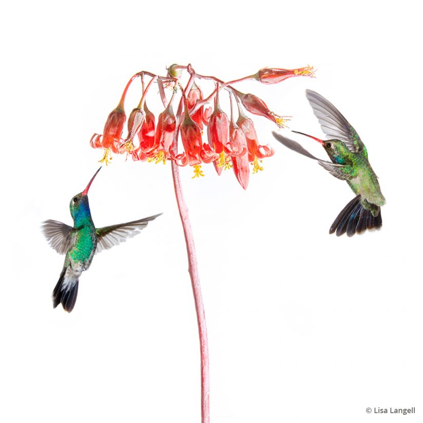
This image of hummingbirds is a composite of three separate shots. When creating artful images—as opposed to documentary photographs—don’t feel confined to capturing every element in a single frame.
This simplified palette and image style is not limited to wildlife. It can work well with certain landscapes, too. It requires contrasting subjects amidst very light sands, grasses or snow, as shown in my pair of images from Monument Valley, Arizona, after a snowfall. The starkness of the snow showcases the trees and rocks and simplifies the palette. It made for a complementary pair of black-and-white images that I adjusted to a soft sepia tone to fit the interior. This piece was created for a gallery showing in Arizona containing about 40 pieces that all were of a similar style.
Go Beyond Traditional Frames & Mounting
To enhance the artistic effect and make the art pieces desirable for my gallery showing in Arizona, I considered the style of interior décor used locally across many upscale suburban and rural homes here. The use of rustic chic, ranch-inspired and Santa Fe styles is not uncommon. That trend inspired my artwork, materials and photography for this exhibit using subjects that were photographed throughout Arizona.
By using local subjects—and locally sourcing the materials for each hand-crafted mounting—I increased the desirability and perceived value by potential clients. My style is inspired by earth tones and rustic textures. To create the vintage look, I first processed and printed the images using my Canon PIXMA PRO-10 printer on Inkpress 300gsm warm-tone cotton rag paper, then hand-deckled the prints using a tool called “The Ripper.” Those images were then each mounted on top of a larger sheet of deckled handmade mulberry paper to add to the look. Locally sourced reclaimed wood was used to make backdrops that support the two-way glass frames used for each image. Weathered branches were added to finish the look for the Monument Valley piece.
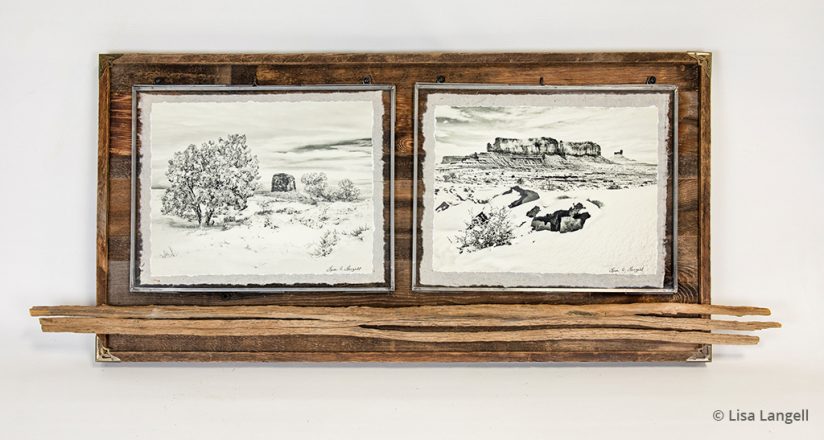
This diptych of photographs from Monument Valley, Arizona, shows how combining high-key images with a vintage sepia treatment and handmade elements can create a much more collectable artwork than a basic print and frame.
If you’re wondering whether this effort truly makes a difference in sales versus traditional nature photography, it does indeed. I have exhibited in several galleries and art shows using traditional nature photography of a very high caliber. Each time, I would get many “oohs and ahhhs” but only sell perhaps a handful of images. I switched to creating my now-signature style of “vintage wildlife” photographic art about two and a half years ago. In one example, I was invited as a guest-exhibitor for 30 days at a local gallery. I sold about 40 large pieces with strong profit margins and had to quickly create more pieces to fill the empty walls before the month-long exhibit ended.
Since that time, this has led to additional sales and sprung new projects with interior design firms, boutique retail stores and more. It continues to be a learning process—which is not unlike what we do with traditional photography as we refine our craft. This has helped define my photographic style. The creative process has brought print sales back as a source of income, inspiration and joy from photography that would not otherwise be possible to achieve.
Expanding Your Creative Options
I still photograph in the “classic nature photography” style on a regular basis, but developing a new style and market for my work has enabled me to shoot throughout the day, given purpose to what I shoot, allowed for far greater creativity and satisfaction—and increased my income as a full-time professional photographer to the point where I have grown my studio and workspace to accommodate more craftsmanship and innovation.
Photography as art is incredibly rewarding if we remain flexible and creative, develop our own unique style, and seek new possibilities. Always ask yourself when you are out in the field, “Where will this image live?” Then, enjoy all of those inspired possibilities and strive to find your work a permanent home beyond your hard drive. You can do it!
See more of Lisa Langell’s work at langellphotography.com.
The post Beyond The Traditional Print appeared first on Outdoor Photographer.

