There are a number of conventional words that are associated with how a photo should be composed. Given their definitions, a few seem quite rigid. The thought of how a photo should be composed shouldn’t make one feel uncomfortable. Let’s take a look at how they stack up based on a hierarchy of their rigor.
Rules: A set of explicit or understood regulations or principles governing a particular activity.
Pitfalls: A hidden or unsuspected danger or difficulty.
Criterion: A rule or principle for evaluating or testing.
Fundamental: A basic principle, rule, law or the like, that serves as the groundwork of a system.
Guidelines: A general rule, principle or piece of advice.
As the list progresses, the definitions become less daunting. It’s with this in mind, I prefer the word guideline when I teach composition. I shy away from the word rule. It infers it has to be followed in a specific way, which is way too stringent.
Composition shouldn’t be “governed.” There are too many circumstances that prove it’s OK to deviate from the norm. Rather than get caught up in a debate over words, I share with you examples where the “rule” fits and also where the rule is broken yet the composition is successful—hence the word “guideline.” To prevent a dispute, let’s continue based on the title of this week’s tip: Compose Yourself—double meanings are always great!
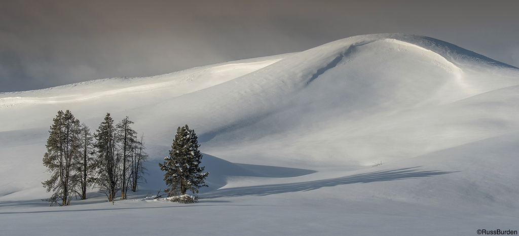
Balance – A successful composition should have equally weighted subjects on all sides: In the image of the group of trees on the left side, there are no offsetting trees and not a single tree, animal or other primary subject lives on the right. The hill, along with the shadow of the trees, is enough to offset the weight on the left. If I adhered to the above rule, I wouldn’t have been allowed to make this photo. I’m glad I did.

Leave Room For Implied Movement – The same holds true for the direction in which the subject looks: Avoid placing a subject too close to the edge of a photo when its motion or gaze has it butted up to the side given the direction in which the motion or gaze carries the subject. In the two photos of the merlins in flowers, the one above has the beak right up to the edge of the frame. The area behind the bird is wasted and the bird’s placement is awkward. In the one at the top of the page, there’s much less tension as the merlin glances across its body to the other side of the photo.
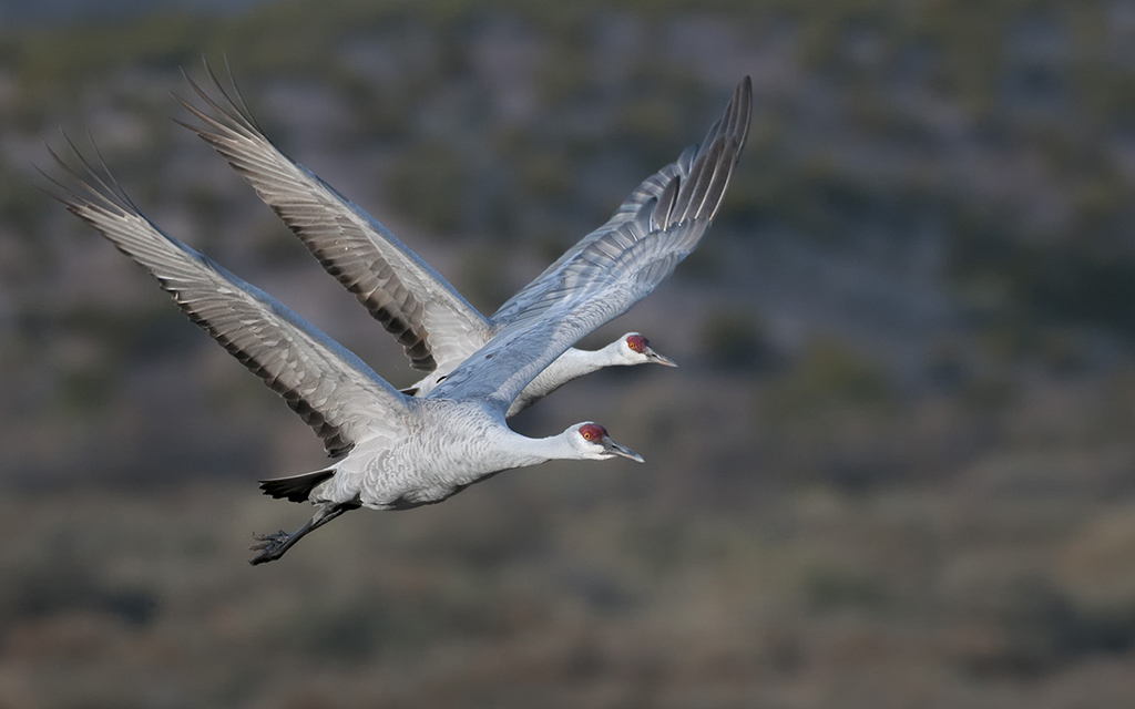
Mergers – Never let one subject overlap another: I often avoid pressing the shutter when I know that one animal may protrude from behind or fall in front of another. When I edit, 98 percent of these compositions meet their demise via the delete button. But there are situations that work 2 percent of the time. I tend to edit quickly but not so fast that I don’t overlook an anomaly where everything falls into place. I do refrain from pressing the shutter when I know there will be a merger, but there are times when I proceed and hope. After all, one never knows when it pays to break a rule. When it works, it feels good.

Leading Line – A leading line should lead the viewer’s eye into the image. They’re often placed along the bottom or sides of a photo and should start near the edge. The line should bring the eye to a secondary part of the composition so the viewer can continue to course his or her way through the rest of the composition. In the image of the snow and office building, the leading line follows this rule and certainly works. Also, note the balance of tree trunks on either side of the photo.

Always Shoot Landscapes 90 Degrees To The Sun – When you point your camera toward the sun, the light is contrasty and shadow detail is lost. Many landscape photographers shy away from this type of light and tell you to always shoot 90 degrees to the sun. It creates texture and a polarizer has its maximum effect so the blue in the sky is enhanced. While these two facts are spot-on true, what if you never experiment? Be a rebel and make some high contrast images. Make photos of subjects where blocked up shadows have no bearing on the outcome of the photo. Look for silhouettes, colorful sunrises or sunsets, or patterns that reflect light.

Rule Of Thirds: The rule of thirds was initiated by the Renaissance masters. It migrated into photography because it works. While there are times when placing a subject dead center can create a successful piece, it’s important to first learn how to apply the rule of thirds so you learn when the rule can be broken and how to successfully break it. The rule of thirds states you place the primary subject in one of the power points. A power point falls at the intersection of lines if you were to place an imaginary Tic Tac Toe board over the viewfinder. The image of the zebra at sunrise follows the rule of thirds and breaks it by putting the acacia in the center. It’s nice to have the best of both worlds.
Visit www.russburdenphotography.com for information about his nature photography tours and safari to Tanzania.
The post Compose Yourself appeared first on Outdoor Photographer.


