While on a camera club field trip a few years back, I conducted an experiment. There were 10 other photographers, and I asked each to set up their tripod at the same height and point it at the same scene as the others. My next request was that they attach a lens of their own choice in the 24-120mm range. I then instructed them to press their shutters at the end of a 10-second countdown. This way, the light would be identical at the time the shutters were clicked. During the 10 seconds, each photographer could contemplate his or her composition. After the photos were made, each photographer looked at the other nine’s playback screen and was amazed to see that no two photos were identical. The results were what I expected. We all view the world with different eyes at different focal lengths. The important aspect to glean from the above is that even though each photograph may look different, what’s important is that the elements within are arranged in an orderly way. Regardless of the focal length, the composition needs to work. In this two-part Tip of the Week on composition, I’ll share six composition conventions to contemplate. Follow up on next week’s tip to see the second three.
Here’s my definition of Composition: Composition is the orderly arrangements of elements within the scene. Key components should be INcluded while those that cause a distraction should be EXcluded.
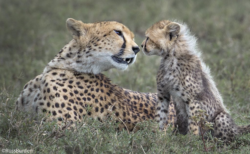
Balance: Balance is the weighting of primary subjects within the composition. The trick is to not have a photo “tip” to the left, right, front or back. Think about a balance scale. If weight is placed on the left, it receives all the attention and the right side is left “hanging.” In a photograph, if any one side is overly weighted, the viewer is left wondering why the other side is included. Successful balance is achieved when the ingredients within the composition are weighted evenly. If there’s a strong element on the right, balance it with something on the left. If a primary subject is found in the foreground, include something at the back of the photo. At the same time, don’t ignore the left and right. In order for the photo to work, the entire photo should achieve balance.
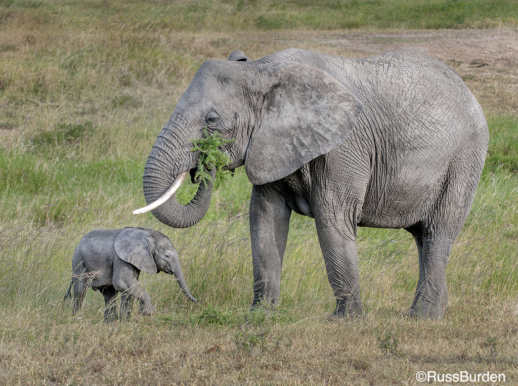
Rule of Thirds: Apply the rule of thirds—it WORKS! The rule of thirds states the primary subject should be placed close to one of the power points within the photo. Power points appear at the intersection of thirds. The intersection appears where imaginary Tic Tac Toe lines cross over each other. Where the lines intersect are where the four power points live. Most beginning photographers place the key element dead center. This creates a static composition. If you place the subject at a power point, the composition is more dynamic. A caveat is when the subject is moved from center to the right, left, top or bottom power point, the other two-thirds of the photo may lack interest. This is why I write about the rule of thirds right after Balance. Just because you position your subject in the rule of thirds doesn’t excuse poor balance. The two go hand in hand, so be sure you balance the primary element placed in a power point with another element that supports it on the opposite side of the frame.
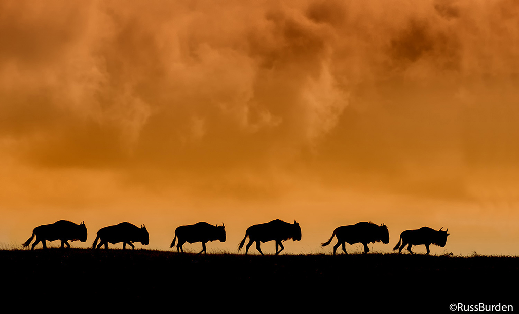
Mergers: Mergers occur when key compositional elements touch or overlap one another. They also appear when the subject and background form awkward connections such as the clichéd lamppost growing out of someone’s head. They also exist when key elements touch the edges of the photo. If there are many subjects in the frame, don’t cut those that appear along the edge in half. Mergers are easier to prevent with single primary subjects as opposed to multiple ones. If you photograph large groups of animals, be careful how they overlap. If you photograph cityscapes, be aware of how one building falls in front of another. Don’t cut halfway into those that live on the edge. Mergers most often occur because photographers concentrate so heavily on the main subject and everything else gets overlooked. Before you press the shutter, study the entire viewfinder to make sure all elements fall into place.
Visit www.russburdenphotography.com for information about his nature photography tours and safari to Tanzania.
The post Composition Conventions, Part 1 appeared first on Outdoor Photographer.


