Get the viewers of your landscapes to feel as if they can walk into your photographs. Make them feel like they were with you when you clicked the shutter. Have them feel they read your thoughts and became part of your experience. Allow them to become one with the photo. An excellent way to engage viewers is to use strategic perspective or what’s known as point of view. Those who study your photos will become involved in the composition and become one with the subjects. I generally use both wide and super-wide angles to accomplish this, but sometimes the light works in my favor to use medium telephotos. Wides are commonly utilized as are low angles, but don’t get locked into feeling they’re the only tools that reveal point of view.
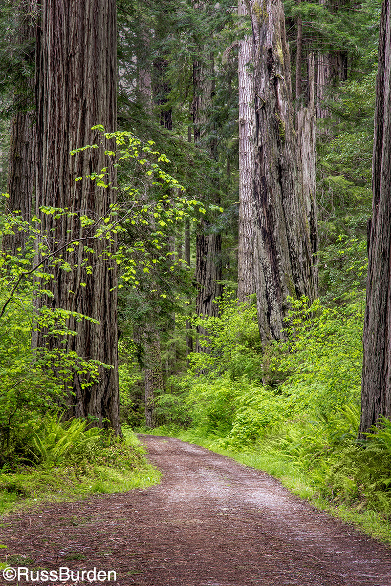
Leading Line, Strong Verticals And Light
In the photo of the redwood trees with the path in the foreground, I incorporated a few strategies. First, I used the path and pullout as a leading line to let the viewer enter the image. This courses the eye from the front to the back. I got low and composed the path so it would strongly contrast with the bold verticals of the trees and bushes. I also waited for a hint of light to fall upon the left side of the dominant tree. Because it’s a highlight, the viewer’s eye gets attracted. The eye tends to go to a bright area of a photo when the surrounding tones are darker.
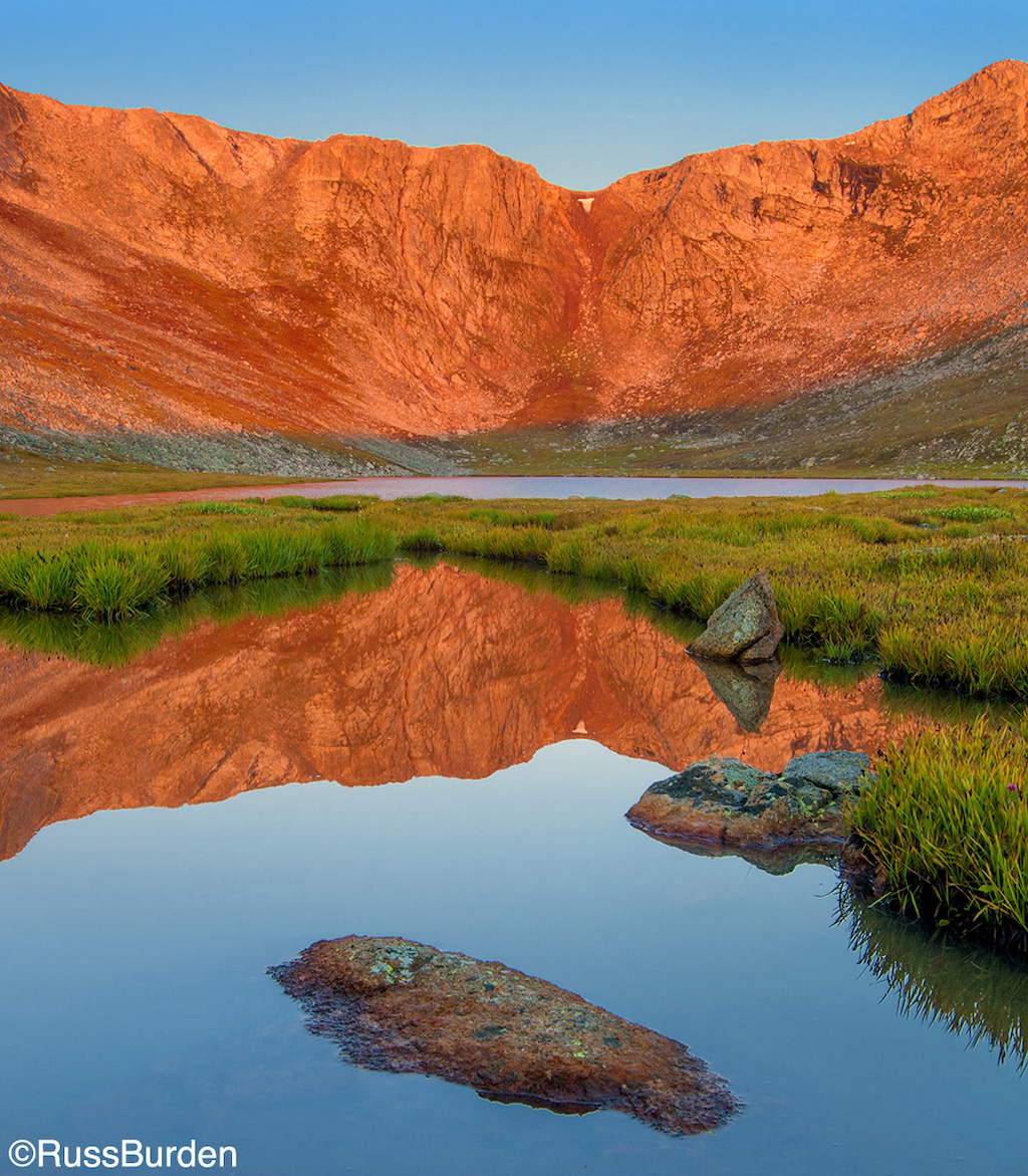
Leading Line, Foreground And Layers
I love the wildlife opportunities on Mount Evans, but I never pass up an iconic scenic. Summit Lake is close to the road as you climb the mountain. On this particular morning, the air was mostly still, which is a rare occurrence given the high altitude. I used a foreground pool of water with an exposed rock to draw the viewer’s eye into the bottom and completed the image by standing at a given height to layer the rest of the planes of foreground, reflection, grasses, lake, mountain and sky. The color contrasts of orange and cyan were a total bonus.
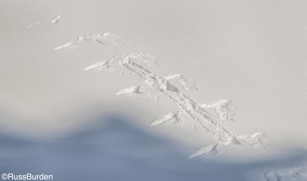
Simplicity In Story Telling
Whether it’s a grand landscape, a close-up of rock patterns or a stand-alone tree, a way to immerse a viewer into your images is to communicate a story. In the small-scale landscape of a bird’s wing patterns on snow, an onlooker will study the image and draw the conclusion the bird made it safely into the air. Starting at the first flap from a standing position, the snow first shows a lot of wing movement and it lessens on the last one at the edge of the frame. A story is told and each person who views the photo will create their own details as to why and how it flew. To get someone to create an individual story after viewing one of your photos is powerful!
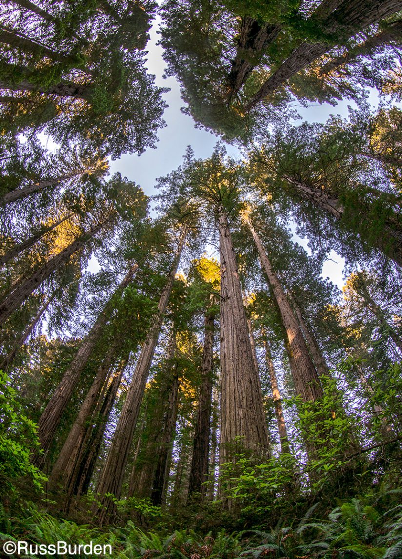
Fish-Eye And Shoot Up
Point a camera toward the sky and you introduce power and strength to a subject. Psychologically, you tell the viewer that you “look up to it,” implying it’s revered and admired. In addition, if you get low to exaggerate perspective with a fish-eye focal length, the subject takes on authority and fortitude. Its magnitude becomes elevated. In the strong vertical photo of the redwoods, I got super low and even included the foreground ferns. They provided a base for the immense trees. I stopped the lens down to a small aperture to attain the necessary depth of field, but you’ll find that the wider the lens, the more forgiving the depth of field is and wider apertures can cover it. Super wides impart a unique perspective that lures viewers given their unique effect.
Tell A Story
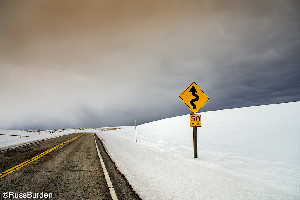
In the photo of the plowed road and snow, I incorporated the dark leading line in the lower left of the composition to “welcome” the viewer into the image. The stark feeling of no cars, threatening sky and road warning sign leave the viewer wondering what’s ahead for the driver: Is it safe? Will I get stuck? Should I make a U-turn? Even though the road is fully plowed, the question of safety exists. When situations like this are encountered, think about dialogue that could be generated, and if you find yourself immersed in self talk, make a photo.
Direct The Eyes Using A Frame
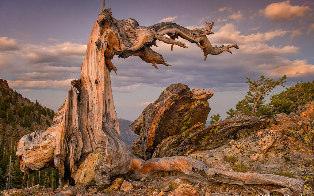
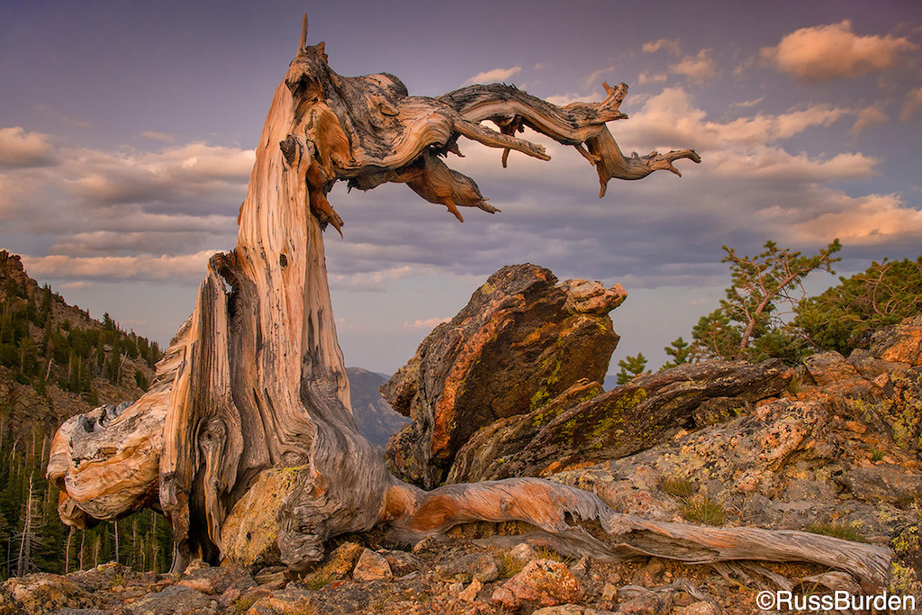
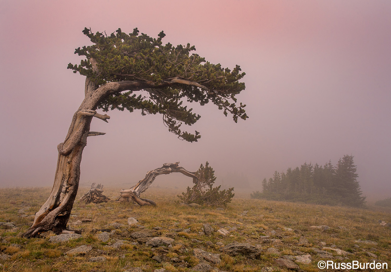
I used the old weathered bristlecone in Rocky Mountain National Park along with its exposed root to frame principle components of the scene (top of page). The top frames the primary rock and foreground trees, blocks the brightest area of the cloud, frames the textures and becomes a subject in the sky. The soft late light adds just enough color to provide a nice warm tone. And most importantly, note how the components of the frame lead the viewer to each of the items mentioned above. As in the image of the redwoods, I used it as a leading line to invite the viewer into the composition, in addition to being a primary subject.
Leave The Viewer Wondering
One of my favorite conditions in which I love to photograph is fog. It simplifies a composition as it helps hide distractions and backgrounds that may impart chaos. As shown above in the photo of the reflected mountain at first light, I search for simplicity—fog provides that. In this photo, the viewer doesn’t know if it was a cold raw fog or a balmy humid day, if it was it made in the mountains, if the fog is rare or happens often, if it was along a coast, etc. Reduce the composition to its basics and create the scene. Use depth to your advantage as the fog either thickens or recedes to reveal more detail.
Minimize
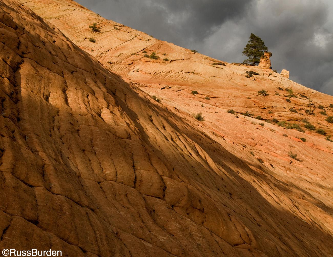
An old adage states “less is more.” While not true for everything, with photography, it often reigns supreme. As evidenced above, you know I love simplicity. In the image made on the east side of Zion National Park in Utah, the eye is drawn to the tree and hoodoo on the ridge yet they make up very little image real estate. I intentionally composed the image to include the dark layers of waffled rock in the lower left. Because they’re subdued, they don’t have prominence but they do serve as leading lines to show off the topography and slowly bring the viewer to the lit area. Note that the brightly illuminated rocks don’t reveal texture! The bright ridge immediately courses the eye to the tree and hoodoo, which it offset by an ominous storm cloud in close proximity. Learn to use negative space to your advantage. Experiment with composition to get a feel for the technique. It works!
When possible, incorporate the above tips into your future landscape photographs. Use them as a baseline to begin your quest to involve viewers in your photos. The more you can immerse the onlooker, the greater the chance it will generate interest in your photography. Let your creativity guide you.
Feel free to explore more of my photography at my website: www.russburdenphotography.com or visit my SmugMug page: https://russburden.smugmug.com.
The post Draw The Viewer Into The Landscape appeared first on Outdoor Photographer.

