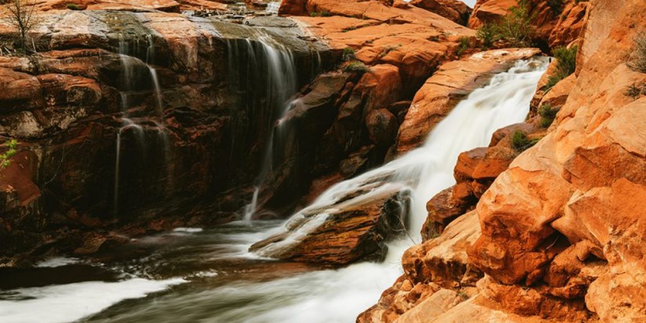
One topic that I don’t often see debated in photography is the merits of horizontal versus vertical compositions when it comes to landscape photos. Both horizontal and vertical compositions play critical roles depending on the subject matter and the emotions you’re hoping to invoke within your viewers. It can be easy to make a blanket statement along the lines of, “Well, humans see things horizontally. Our eyes are set laterally, not vertically. So, it makes sense to compose horizontally.” And while no one can argue with any of that, I would have to disagree that just because we see horizontally, we should compose as such—at least not exclusively.


The question I ask myself whenever I’m composing a photo is whether my intended focal point or subject would benefit more if it were presented in a horizontal or vertical orientation. A lot of the time, the choice is made based on the qualities of the strongest lines within the photo. If the subject, or the collection of subjects, has more of a horizontal flow, then that is the way I’ll compose the shot. Other times, when the strong lines within the frame flow up and down, or at predominantly vertical trajectory, then that’s how I will frame things up.
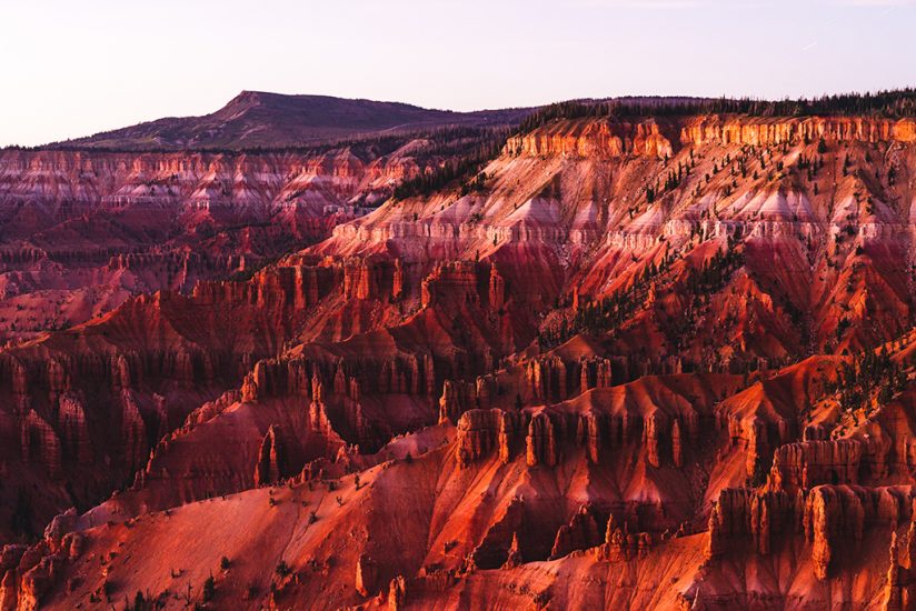

Lately, though, I’ve given myself the freedom to explore both options. All of the photos in this post were taken on my last few shoots. It was during these shoots that I challenged myself to find both a horizontal and a vertical composition for whatever my subject matter was. That, in and of itself, proved to be a wonderful challenge at times and considering that it costs nothing to take one extra photo (assuming we’re talking digital), then why not experiment? At the end of the day, I’d rather have the luxury of options when it comes to my compositions and I think you’d prefer to have that, too. So, give it a shot—take one of each and see what shakes out.


See more of Brian Matiash’s work at matiash.com.
The post Horizontal Versus Vertical Framing In Photography appeared first on Outdoor Photographer.

