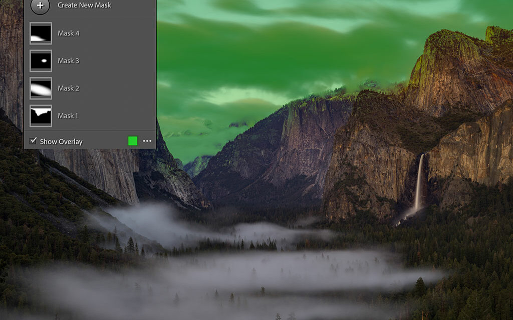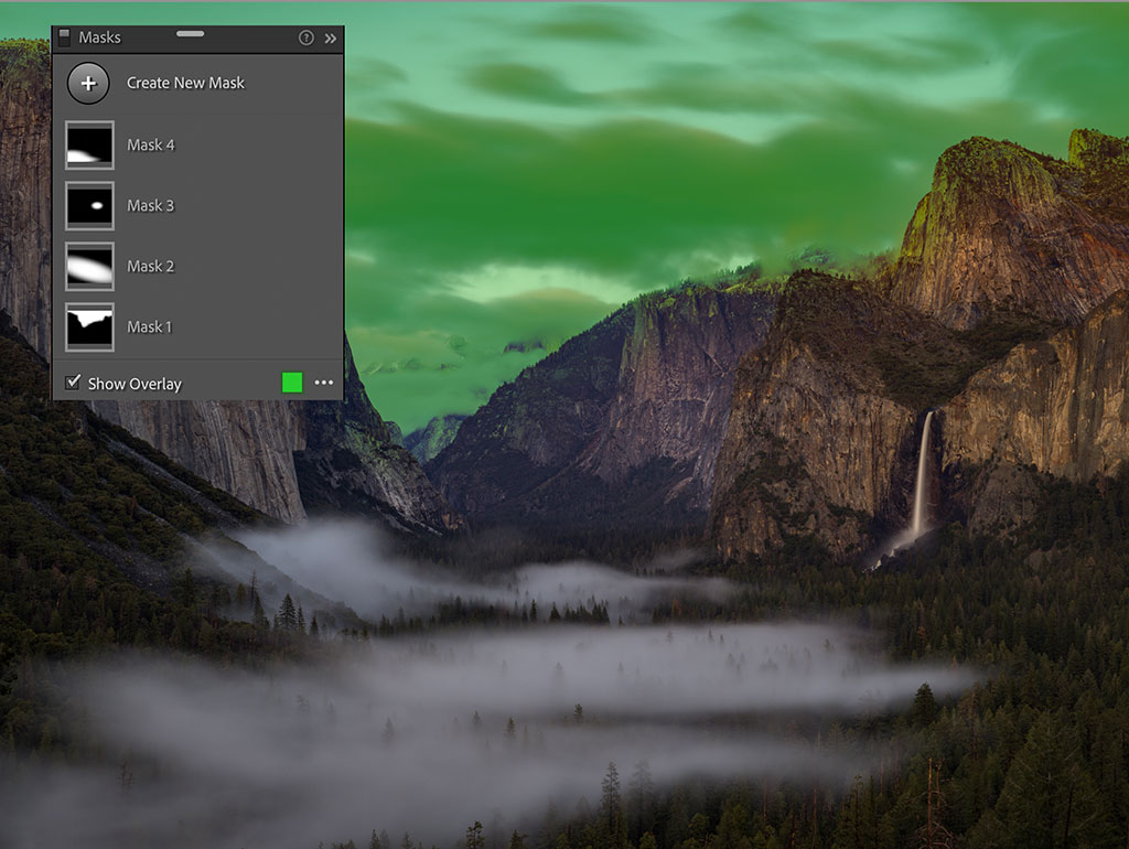
Figure 1. Four masks applied to an image of Tunnel View at Yosemite National Park.
What’s the secret to creating a great photograph? What are the elements that make a photograph successful? Truthfully, even though photography is how I make my living, I’m not sure I can give a concise answer. It would be too long-winded to fit into one little article. What I can say somewhat concisely is that good photography is a dance between science and creativity, objectivity and subjectivity, and luck and craftsmanship.
Masking is one of the most powerful tools we have for the craftsmanship aspect of our photography. Lightroom Classic’s masking tools make it significantly faster and simpler for photographers to develop and stylize their work, ultimately making the goal of creating a “great photograph” that much easier.
Lightroom’s Updated Masking Tools
Masks aren’t new to digital photography or even to Lightroom. Essentially, if you have used localized corrections in Lightroom, then you’ve used masks. In the most recent update to Lightroom’s masking tools, Adobe repackaged many capabilities that were already there; they just weren’t previously called masks. But this wasn’t just a rebranding exercise—the tools have gone through a significant makeover.
For starters, the old Localized Correction tools in Lightroom consisted of the Adjustment Brush, the Radial Filter and the Graduated Filter. There wasn’t much to them, but they were serviceable. I certainly didn’t complain much. Now we have eight options to choose from: Select Sky, Select Subject, Brush, Linear Gradient (which is the same as the Graduated Filter in Lightroom’s previous version), Radial Gradient (which is the same as the Radial Filter in the previous version), Color Range, Luminosity Range and Depth Map (see Figure 2). Even though the names of the pre-existing tools have changed, the tools themselves still work in the same ways.
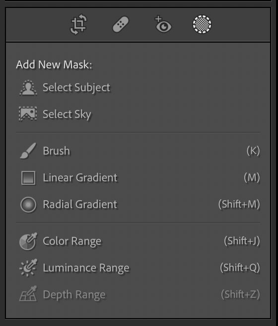
Figure 2. A screenshot of the list of mask types we can apply to our images in Lightroom.
(Note that Depth Range is a new feature that will be inaccessible for images made with most cameras. To take advantage of this feature, you’ll need to use a file from a camera—like an image captured in Portrait Mode on an iPhone—that has a depth map embedded in the file. Then you can play with expanding or contracting the depth-of-field in post-production.)
The first two masking tools listed above, Select Sky and Select Subject, are what most excite me. They represent a new kind of technology, Adobe’s contribution to the world of Artificial Intelligence, or what’s now referred to as AI photography. This is a form of computational photography that relies less on optics and traditional methods of capturing imagery and instead relies heavily on computers to create the image.
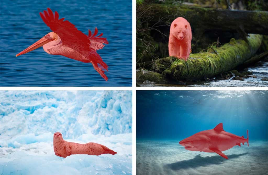
Figure 3. Using Select Subject is easy. With one click of Select Subject and no additional finessing, Lightroom can mask off all these different types of subjects.
What do Lightroom’s new AI features do? Exactly as their names suggest, they can identify the sky or subject in a photo and mask it automatically, and they work surprisingly well. You can also select the inverse of any mask that you create. For example, if your goal is to adjust everything around the subject instead of the subject itself, you can use Select Subject to create a mask and then invert it. In this case, look to the Invert checkbox just above all of your adjustment sliders.
Until now, localized corrections required photographers to manually apply an adjustment to a part of the image by way of one of those three pre-existing tools I mentioned. Because the new AI technology creates masks automatically, it feels a bit like I’m cheating when I’m using it.
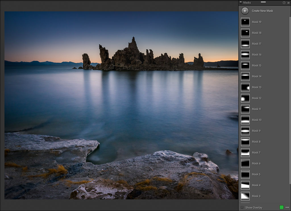
Figure 4. When you open the Masking Panel with images that already have masks applied, it will display a list of your existing masks. They are listed in the order they were created by default.
Look at the four example images of Figure 3. I’ve masked off different kinds of subjects: a bear, a tree, a shark and a lion. All I did was click on Select Subject, and within a matter of seconds, Lightroom generated a mask. It’s admittedly not always perfect, but a lot of the time, it is, and for those images where it’s not, it’s relatively easy to fine-tune the mask.
As cool as it is to have a mask created automatically with AI, it’s actually not my favorite thing about AI. What I really like is the quality of the masks Lightroom now generates. What I mean by that is that Lightroom doesn’t have a great track record of masking edges. That’s evident when using the Auto Mask feature with the adjustment brush—it’s a great way to create unpleasant halos around an edge. In contrast, the vast majority of the masks I’ve created with the new AI tools come with well-refined edges, and the resulting adjustments print well at any size. It’s impressive.
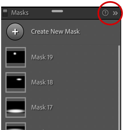
Figure 5. If you need a reminder about the masking tools’ features and keyboard shortcuts, click on the question mark icon. You can also click on the icon at its right to minimize the Masking Panel.
Using Masks Effectively
Masks allow you to confine adjustments to specific areas of a photograph rather than making global adjustments. RAW files are rarely perfect, so dodging and burning and modifying parts of your image in different ways is crucially important in order to gain tonal and textural consistency, and to direct your viewers’ attention to the part (or parts) of your frame you deem important.
The first step to working with masks in Lightroom is to understand what it is that we are looking at with this set of tools. For starters, your masks are organized in a list. When applying your first mask to any image, or to adjust an image that has a set of localized adjustments already applied to them, first click on the Masking icon (or Shift + W). The Mask panel will open up, revealing a list of all the current masks used in the image (see Figure 4). Masks are automatically named, and you’ll see a series of boxes with some black and some white areas. White represents the areas of the image where adjustments have been made and is helpful in identifying the mask by its shape and location in case you want to select that mask later to change or refine your adjustment.
The Mask panel by default appears detached from the rest of your adjustment panels. You can grab the header of the Mask panel at any time and move it around to help clear your view of a part of your image you want to see. Also on the panel header are two small icons on the right (see Figure 5). If you click on the tiny question mark, this will display a list of shortcuts to help you navigate the masking tools. You can click on the small icon to the right of the question mark to minimize or expand the panel. If the panel still feels like it is in the way, you can also grab the header and dock the Mask panel with your other adjustments, as shown in Figure 6.
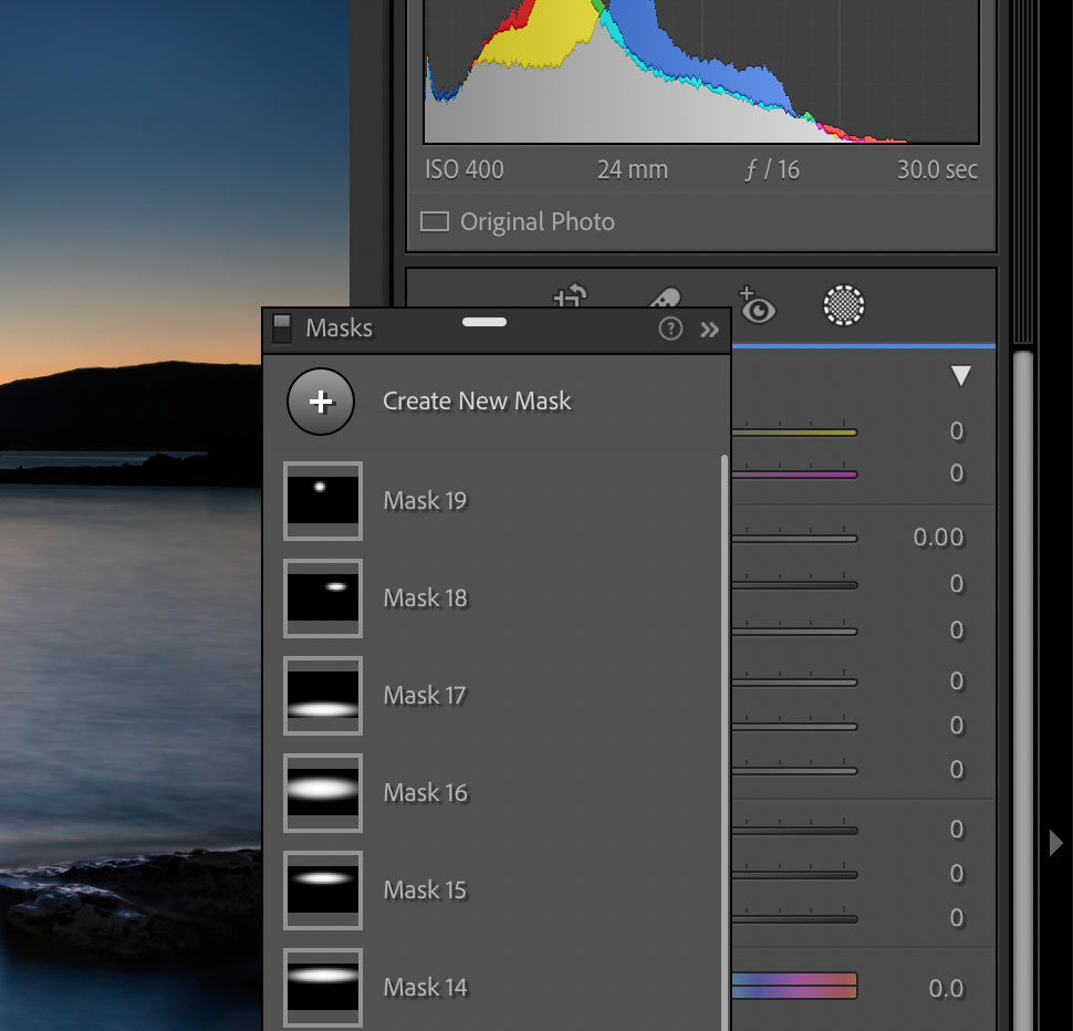
Figure 6. You can move the Masking Panel wherever you want on the screen. By default, it’s displayed detached from the rest of your adjustment panels, but if you feel it’s in the way, you can grab the header of the panel and drag to dock it with the others.
Mask Overlays
Mask Overlay is a great feature that has taken center stage in Lightroom’s updated masking capabilities. It was available before, but I was always surprised how few people knew about this option. The Mask Overlay function wasn’t obvious, and you had to turn the overlays on manually to use them.
Mask overlays can be quite helpful when modifying your mask. As an example, let’s say you create a mask that doesn’t hug the edge of something the way you intended. Mask overlays act as a helpful guide, offering a better view of where your adjustment is or isn’t, and even show you the rate at which your adjustment fades away as you erase it.
What I mean by this feature now taking center stage is that Lightroom’s new default is to show a red mask overlay on your image each time you create a new mask. It’s also now the default behavior to show you your mask with the overlay each time you select it. This does admittedly obscure the view of the adjustment or the part of your image where the mask is being applied, but that’s easy to fix.
Mask overlays can easily be turned off or on by unchecking the Show Overlay box at the bottom of the Mask panel or by tapping the O key. If you’re like me and don’t want Lightroom to always obscure image details with a mask overlay automatically, click on the ellipsis to the right of the Show Overlay checkbox to bring up the Mask Overlay settings. Then uncheck Automatically Toggle Overlay, as shown in Figure 7. From then on, you’ll have to turn your mask overlays on and off manually.
There’s more to the Mask Overlay settings menu. For starters, mask overlays offer different modes that can further assist you when fine-tuning your image. Personally, I love using the Image on B&W overlay, but toggle through them and play to discover your preferences. You can simply click on your choice or toggle through them by pressing Option + O on a Mac or Alt + O in Windows.
In addition to Overlay Modes, look to the bottom of the Overlay Settings and click on Color Overlay Settings. Now you can choose any color or adjust the opacity for your mask overlay. This comes in handy if your mask color is the same color as the elements it covers in your image. In this case, it can become difficult to distinguish one from the other, making fine-tuning more challenging.
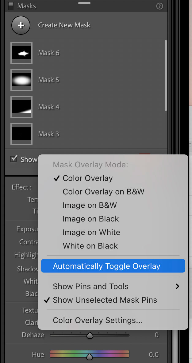
Figure 7. Mask overlays can obscure the view of your adjustments. If you don’t want them to appear automatically, disable Automatically Toggle Overlay in the Mask Overlay settings.
Luminosity & Color Range Masks
Luminosity and Color Range masks are a couple more features that existed before but, like Mask Overlays, were more in the background. Range masks are a very effective way to target a specific zone of your image for modification.
Essentially, range masks allow you to create selections based on a range of luminosity or color values. There are a couple of ways to apply range masks. Begin by using your range selector, as shown in Figure 8. You can either click on a brightness value while in Luminosity Range mode or on a specific color when in Color Range mode. Needless to say, luminance and colors vary, so one click on one spot may work, but you’re usually better off clicking and dragging over a range of brightness or color values. A third way of selecting a range is by clicking on a specific value, then holding down the Shift key and clicking on another or multiple values. (If you do the multiple click method, you’re restricted to five tones.)
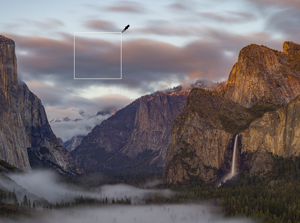
Figure 8. When using Range masks, begin with using the color or luminosity range eyedropper selector to either click on a single tonal value, or click and drag over a range of tonal values that you intend to adjust.
Modifying Masks
Without question, you’ll need to modify your masks and fine-tune your adjustments. Regardless of how good the new AI features or range masks are, rarely are selections perfect. Masks need to be finessed and artfully refined to ensure they look natural. Your adjustments need to be believable.
There are multiple ways to modify a mask. With each mask you create, you have the option to add or subtract from the mask. For example, if I create a radial gradient, but I want that same adjustment to touch on a few areas outside of the initial ellipse, I can click on Add, as shown in Figure 9. Then I can select parts of the image—by whatever method I want—to add to the mask. I can create another radial gradient or choose any of the other options. I can also click Add multiple times if I want to add that adjustment to multiple areas. Or I can click on Subtract. Doing so allows me to erase from an existing mask instead of adding to it.
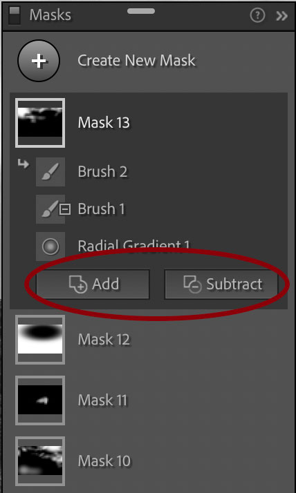
Figure 9. After an adjustment has been created, you can click on either Add or Subtract to modify the mask for that adjustment.
Pro tip: I find that a Wacom tablet with a pen is a great tool when modifying masks, especially for fine-tuning and refining edges. A tablet is a much more efficient tool than a regular old mouse or trackpad.
You can intersect masks with other masks. If you hover your mouse over any of your masks, an ellipsis and an eyeball icon will appear to the right. Click on the ellipsis to bring up your Mask settings, and you’ll see an option to Intersect Mask With, which enables you to choose from your list of masks.
Intersecting Masks is a way to create a mask within an existing mask. If there’s something specific I want to target—let’s say the color of a hiker’s jacket—I can begin by creating a mask of the hiker by way of Select Subject. Then, to target just his jacket, I’ll select Intersect Mask With, then click on Color Range to select only the green jacket. From there, I can play with the Hue sliders, and then sliders such as Saturation and Temperature and Tint to fine-tune the look. See Figure 10.
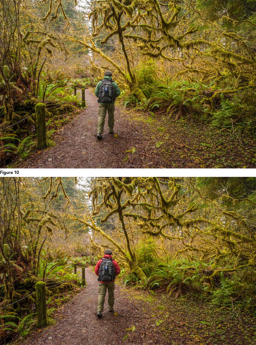
Figure 10. Intersecting masks are a way to create a mask within a mask. Here, I used Select Subject to isolate the hiker, then created a Color Range mask to isolate the jacket, so I could change its color from green to red.
Things Are Starting To Shape Up
Giving a concise answer about what makes a great photograph or how to create one is challenging, to say the least, but the art of image development absolutely plays a crucial role. Localized corrections are just as important today as they were in the traditional darkroom. They’re how we express ourselves creatively and refine what we are trying to communicate through a photograph.
To master the art of masking, it’s all about the quality and shapes of the masks you create. The success of localized corrections depends on how good one is at creating the mask and then fine-tuning until the adjustment sits seamlessly with the rest of the image. Lightroom’s latest masking tools represent a big advancement in photographic technology, improving our workflow efficiency and ability to express ourselves creatively.
See more of Jason Bradley’s work at bradleyphotographic.com.
The post How to Master Lightroom’s Masking Tools appeared first on Outdoor Photographer.
