Shadows make up the dark and very dark portions of an image. When post-processing, the blacks and contrast sliders are utilized to open them up or tone them down. Although they can be completely void of any detail whatsoever, at times they’re an integral part of an image. When you create a composition, it’s essential you’re aware of them as shadows draw the viewer’s eye. Highlights do the same and can be very distracting. If the blackened positions of the shadows don’t add interest, your image will be glanced over quickly.
Shadows can be beneficial to make brighter parts of the composition pop. When a lit subject is offset against a dark shadow, the subject stands out prominently. The resulting photo will be much more three dimensional because anytime a bright tone is placed in front of a dark tone, it provides layering. If that same subject was juxtaposed against an illuminated area, a tone merger occurs and the subject simply blends in to the background as opposed to standing out. Six images accompany this week’s Tip of the Week. Let’s see how shadows impact each.
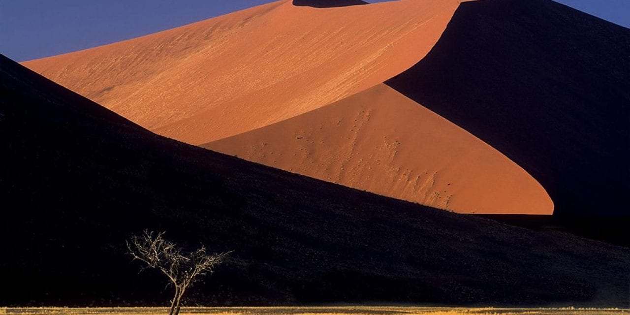
Orange Dunes Of Namibia
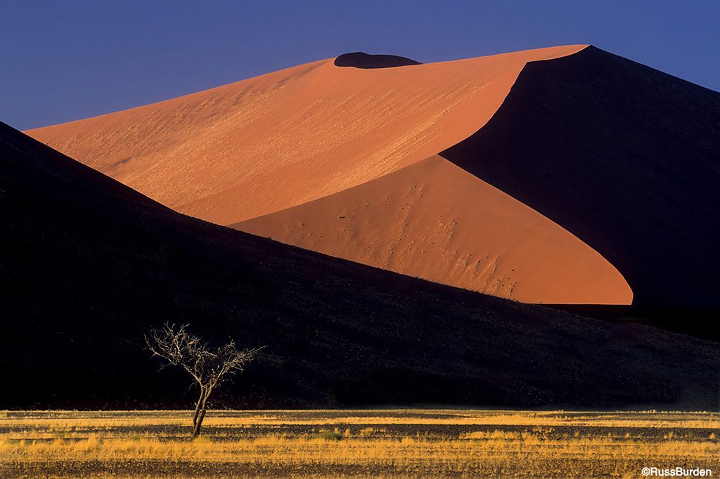
The deep black shadows are very graphic and command an equal amount of attention as the illuminated section of the dunes. They help create a pattern that’s a key component of the photo. The other aspect is the balance in the composition. The right side of the dunes are compositionally much heavier in weight because of their height. The tree in the lower left is key as it relates to this week’s tip. It draws attention based on the light. The tree is illuminated and the area behind it is solid black. It becomes three dimensional. If the dune behind the tree received the same illumination as the bight dune areas, the tree wouldn’t have graphic impact.
Winter Tree In Yellowstone
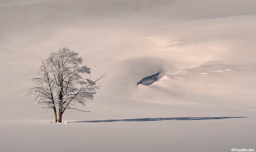
This photo was made not long after the sun rose above the horizon. As a result, the sidelight is strong and creates long shadows. The frost on the tree was a bonus as was the depth of snow in the year this image was made. The contour of snow on the landform in the background is an integral part of the composition despite the fact it’s not the most exciting formation in the photo. The shadow of the tree leads the viewer to the edge of the right side of the image. As the eye traverses from left to right, it also scans what’s above and below the shadow line. As a result, the indentation in the snow becomes more important as do the tiny areas of vegetation that have their heads poking out of the deep snow.
Side-Lit Rhino
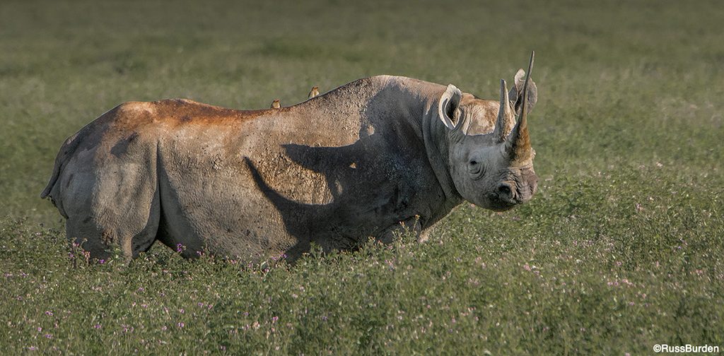
I LOVE the Ngorongoro Crater for many reasons, one of which is there are black rhinos that are permanent inhabitants, and they provide a great opportunity to see and photograph in the open. The image of the one seen here was made very early in the day as the sun crested the top of the crater. It wasn’t until he turned his head toward me that I got excited for two reasons. The lesser being he now made eye contact. I always tell the participants on my safaris to make sure there’s a connection with you and the animal. To have the animal face you is better than if it looks away. The more important reason I got excited was due to the shadow his two mature horns cast across his body. The echo of the horns on his snout that cast a shadow on his side provided an additional dimension to the photo. I find myself studying the shadowed horns more than the ones on his head.
Spider Web
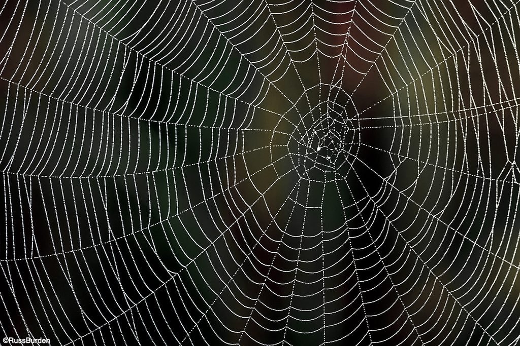
The shadow in the image of the spider web is critical. Every droplet of water sparkles like a diamond. The water drops pop due to the extreme contrast between them and the dark background. If the background was illuminated, the image would have no impact. Light was falling on the spider web but not on what was behind it. This produced the perfect lighting scenario. I couldn’t have asked for more accommodating illumination. The one aspect that had to be considered was exposure. The background is dark. This tells the meter to add a lot of light. Had I simply gone by what the meter said was proper, every droplet of water would be grossly overexposed. As a result, I dialed in 1 1/2 stops of minus compensation. This brought the highlights on the histogram to where they needed to live.
White Sands, New Mexico
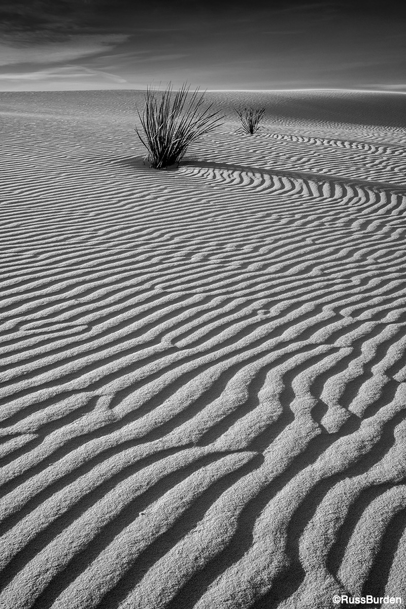
I added this image to throw in something out of the ordinary from what I usually share on my Tip of the Week. I converted the RAW file to black and white using Silver Efex Pro to emphasize the contrast between the highlights and shadows. As a long-time worker in the black-and-white darkroom, I saw something in this composition that said to make the conversion. The dark shadows in the sand, contrasted against the brighter highlights, allows the viewer to course his or her way through the image from the very front, then to the yuccas, then to the horizon and finally to the top of the photo since the sky and clouds also work well in black and white. One of my favorite sayings is Exhaust All Possibilities. Adopt these words and think outside the box. That’s what got me to include this image in this week’s tip.
Zion Sunrise
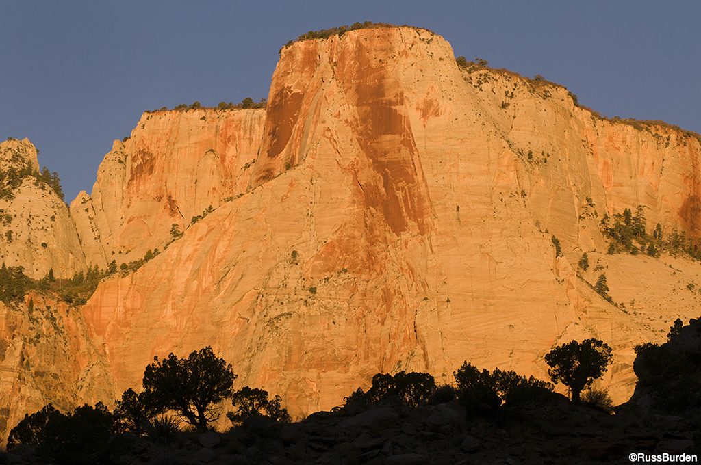
The image of the row of trees under the red rock monolith falls into the category of a silhouette, but because a silhouette is a shadow totally bereft of detail, it qualifies for this week’s tip. The row of vegetation has a definitive outline and is easily recognizable, therefore it works. In post processing, I moved the black slider to the left to totally remove all detail as there was some in the RAW file. The importance of the shadow in this photo is it provides a base, gives the background formation scale, creates contrast and establishes a sense of place.
Visit www.russburdenphotography.com for information about his nature photography tours and safari to Tanzania.
The post Importance Lurks In The Shadows appeared first on Outdoor Photographer.

