Interpreting color in an image is our prerogative as photographers. Some will decry overly saturated colors as unnatural, and I’ll admit to sharing the opinion that it’s easy to go too far with color adjustments, but ultimately it’s up to you to decide what looks best for your photographs.
Whatever your preferences, a good place to start when developing an image is with neutral, balanced color and make further adjustments from there if desired. The following technique uses the curves tool to get to that neutral starting point. I generally prefer to shoot in RAW, so in this example I’ll be using Adobe Camera Raw, but you can use it with JPEGs, too, in any software application that offers curves adjustments.
This technique to achieve neutral fall color is part science and part art. The science comes from comparing and adjusting the RGB values of three target points in the image: one white point, one black point and one gray point. The art is in selecting those points.
The fundamental concept to understand is that when the RGB values for a given pixel are identical, you have a color-neutral pixel. For example, a pixel with values of R=255, G=255 and B=255 is pure white, while one with values of R=0, G=0, B=0 is pure black. By targeting three points in an image—one white, one black and one gray—and adjusting their individual RGB values to be as close to identical as possible (I aim for a variance of 3 or less), you’ll arrive at neutral color throughout the image.
Step 1: Make A Basic Exposure Adjustment
The first step—before selecting your black, gray and white target points—is to get the exposure in the ballpark of where you think it should be. This is especially necessary for processing RAW captures, as the camera hasn’t made any adjustments for you. Figure 1 shows the original capture in Adobe Camera Raw, and Figure 2 shows the result of bringing the exposure down to -1.69.
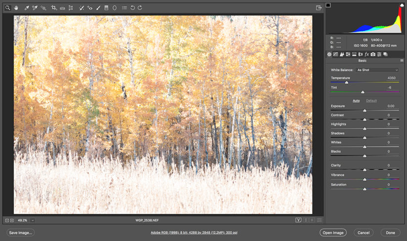
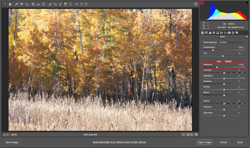
Notice the clipping warning at the top left of the histogram in Figure 2. This is indicating that the blue channel is being clipped (losing data). Ideally, you won’t have any clipping; in this case I had to choose between clipping the red channel in the image’s highlights or clipping the blue channel in the midtones. I opted for the midtones because I was confident I could bring that back later. It’s not absolutely critical that you have no clipping, but keep an eye on those warnings and avoid it whenever possible.
Step 2: Targeting With The Color Sampler Tool
With the exposure set, the next step is to select a white, gray and black point in the image. To do this in ACR, you use the Color Sampler Tool, which looks like an eyedropper with a small target, found in the toolbar above the image. First, I selected a white point. Choose a spot that is as close to pure white with no detail as possible. Specular highlights are ideal.
Next, I chose the gray point. This one is the trickiest of the three and is where the “art” of this technique comes in. Do your best to find an area that should be a neutral, midtone gray. White objects in shadow can work well.
Last, I selected the black point, a black spot on one of the trees that was also in shadow. Every image is different, and you may not get pure white or pure black. The technique will still work as long as you get close.
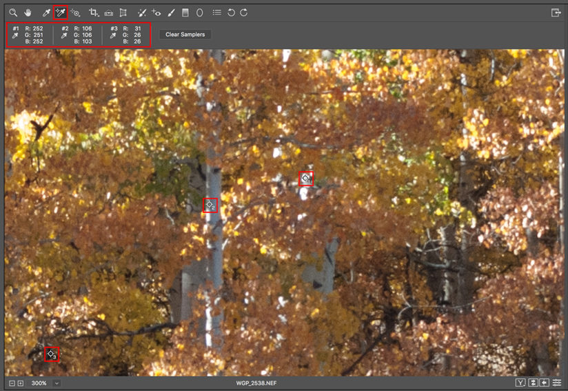
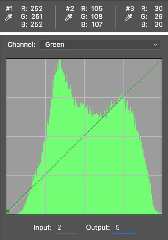
As you can see in Figure 3, the white point was nearly pure white, with a value of R=252, G=251, B=252. The gray point was less neutral, with values of R=106, G=106, B=103. The black point was less neutral still at R=31, G=26, B=26. Overall, though, this was good news, in that these values are already pretty close to neutral and I wouldn’t need to make major adjustments.
Step 3: Adjust The Gray Point
With the target points set, I switched to the Tone Curve tool. In ACR, it’s the second tab in the tool palette. I like to start by adjusting the gray point. With the tone curve tab open, select the “Point” tab. You’ll now see a graph of all three channels’ values, with the pure black on the bottom left and pure white at the top right, and a diagonal line connecting those points. The diagonal line is what you will click and drag to adjust each of the target points’ values.
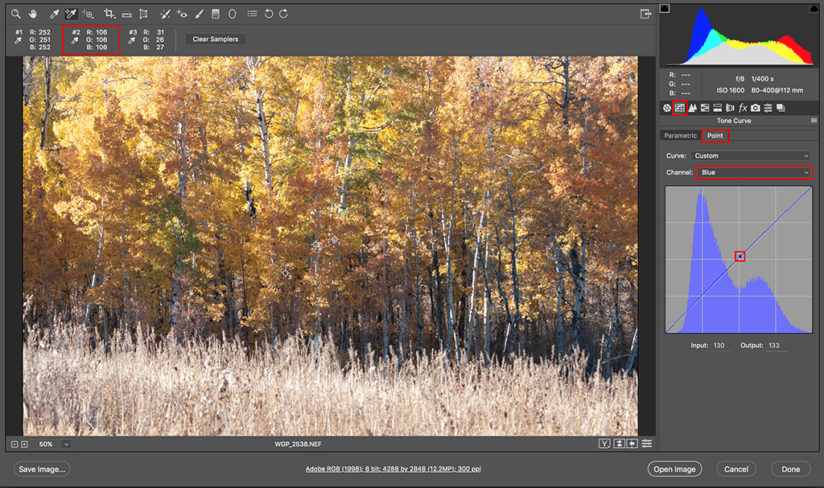
In this example, the gray point’s red and green values were identical at 106. It’s the blue value I wanted to bring up to match, so in the Channel dropdown, I selected “Blue.” Since I was adjusting the midtones, I clicked on the center of the diagonal line (in the middle of the grid) and dragged that point straight up until all three values, R, G and B, were identical at 106. Bonus—the blue channel clipping from Step 1 was corrected by this adjustment. That was it for the midtones in this example.
Step 4: Adjust The Black Point
Next, I adjusted the blacks. Since the only option is to increase the values at the black end of the curve, I needed to increase the output of the blue and green channels (both with values of 26) to get closer to the red channel’s value of 31. I started with the blue channel, clicking on the bottom left corner and dragging straight up until I got a value of 30. In doing so, the red channel also shifted to 30 (Figure 5). Don’t be alarmed when this happens. Adjusting one channel can affect the other channels’ values and the other target points’ values as well. This technique requires some tinkering back and forth—keep your eye on the values as you go. The goal is to get them as close as possible.
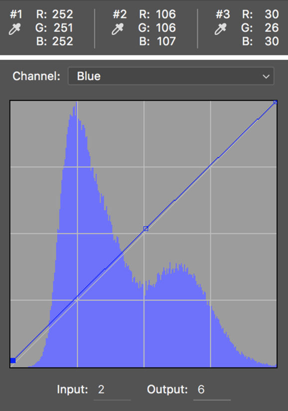
With the red and blue values now both at 30, I switched to the green channel, clicked and dragged it up (Figure 6). I stopped at 29 instead of 30, because moving it further affected the red and blue channel values. Again, tinkering. With this adjustment, all three points now had RGB values at my desired variance threshold of 3 or less.
Step 5: Adjust The White Point
Depending on your image, you may need to adjust the white point’s values as well. This is done with the opposite approach that I used for the black point. You can only decrease the output of the channels at this end of the curve, so you’ll pull down the two channels with the highest values to meet the lowest of the three by repeating the technique above, but instead clicking on the top right corner and dragging down with the appropriate channel selected. Since my values were already very close (Figure 5) at R=252, G=251, B=252, I was satisfied with the curves adjustments and skipped this step, and was ready to make my final enhancements.
Step 6: Do Your Thing
At this point with the technique, you’ll have an image that’s essentially color neutral. Now you can apply your artistic license to achieve your vision for the image, knowing that you’re starting from a balanced foundation.
In this example, I returned to the Basic tab of the ACR tool palette to make some final adjustments to the exposure (Figure 7). Using the slider controls, I increased the Contrast a small amount, modestly decreased the Highlights and Blacks, and considerably reduced the Whites, all the while keeping my eye on the histogram’s clipping warnings and dialing back adjustments when clipping occurred.
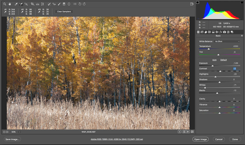
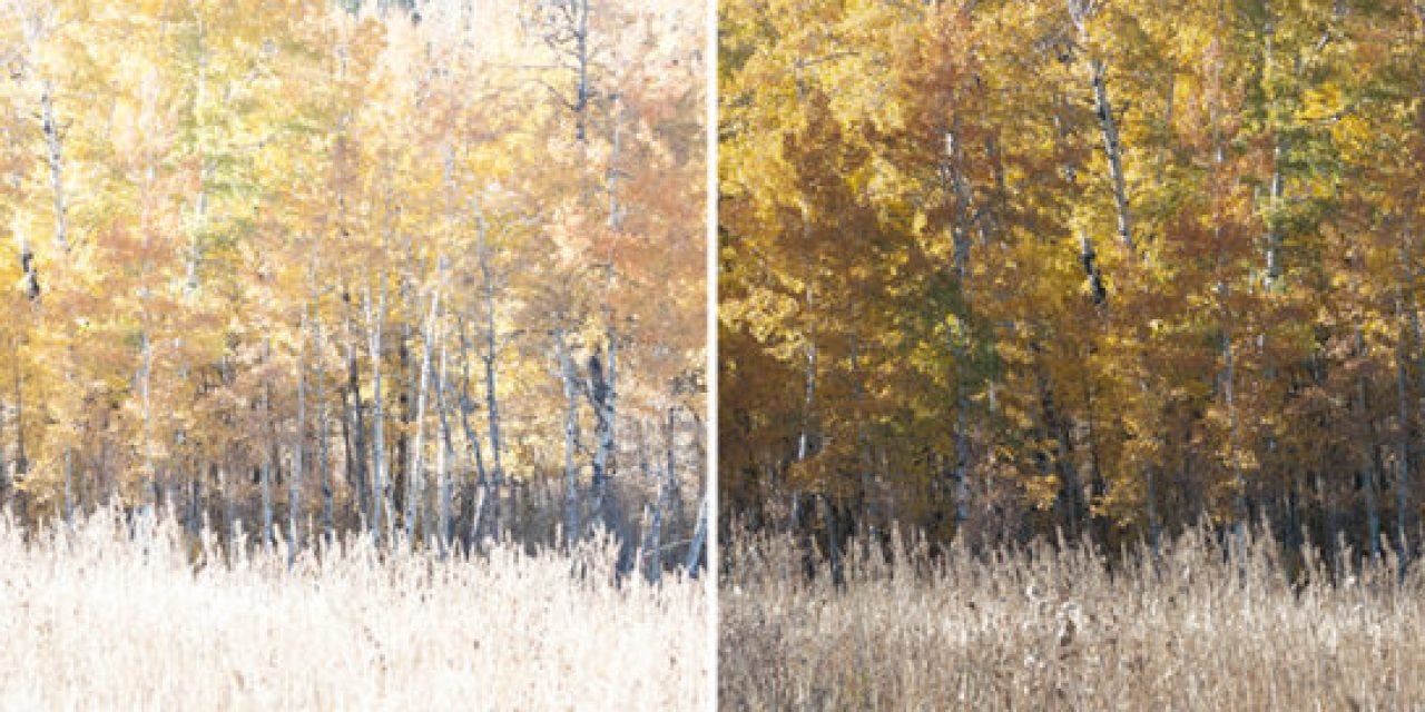
As a final step, I clicked “Open Image” to leave Adobe Camera Raw and proceed to Photoshop, where I did a little rotating and cropping of the image to straighten the horizon line, as you can see in the before and after image at the opening of this article.
There are, of course, numerous approaches to image development, many of which are faster and less involved than this technique, but I come back to it time and again because I’m confident that whatever creative choices I make after the curves adjustments will be from a neutral starting point. I hope you’ll find it useful, too.
The post Processing For Neutral Fall Color Photos appeared first on Outdoor Photographer.

