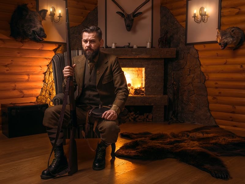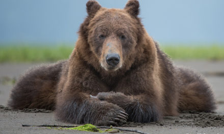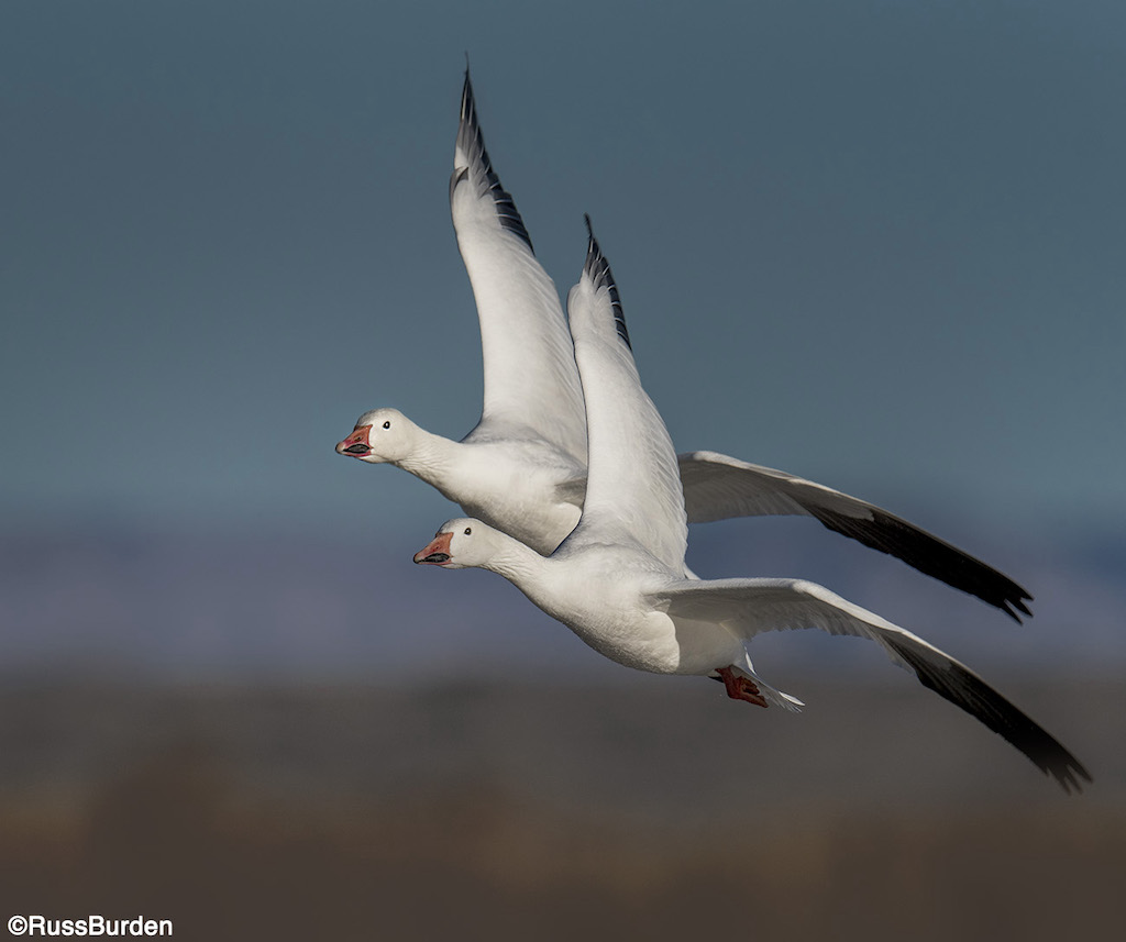
Regardless of where patterns and textures appear, designs of intertwined networks await the discerning photographer to capture, isolate and turn into works of art. Many factors come into play that dictate whether or not the photographer should contemplate aiming his or her lens at a subject that catches the eye. Does the pattern itself convey symmetry? Are textures significant? Will it work in both color and black and white or will one voice have more impact? Last week, we learned about incorporating nature’s shapes and lines in your photography. Now, in part 2, we’ll cover patterns and texture, and whether black and white or color is a better choice in certain situations.
Patterns
Interesting patterns are everywhere. From close-ups on the side of a boulder to the bark of a tree, patterns can be extracted. Whenever like colors, shapes, lines or textures are repeated in specific or even random intervals, the potential to make successful pattern photographs exists.
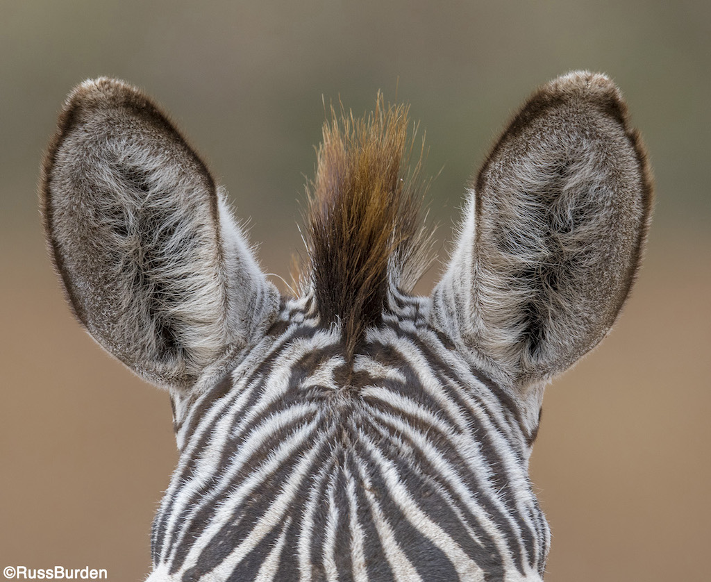
Patterns reveal themselves in different ways. Natural ones can be rhythmic, harmonious, flowing or random. Regardless of how they’re conceived or displayed, the job of the photographer is to depict order. The word rhythm infers repetition in arrangement. This can be shown in the hexagons of a honeycomb, erosion scars on rocks, sections of a meandering stream, layers of sediment in the desert Southwest and more.
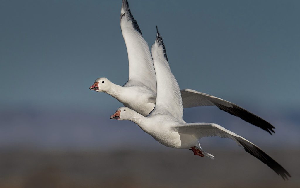
Harmony implies togetherness and agreement. Patterns can be harmonious when the elements are unified. The items don’t have to be exact duplicates of each other, but they need to blend together. Cracked mud beds, fields of flowers, the shadows of tree trunks on a virgin snowfield, the fronds of a palm leaf and zebra or giraffe hide are all great examples. Patterns that flow or those that are random make wonderful photographic subjects. They can come together by chance or be fixed in their occurrence. Hundreds of ducks in a city pond can net an image of chaos, yet when all flow in unison, unity can be captured.

When seeking out patterns, look for compositions where a single element breaks the uniformity yet doesn’t interfere with its integrity. This creates a focal point for the eye and makes the image stronger.
Texture
Texture is often overlooked as a photographic subject. It can be found in ripples on a river, a large section of cactus, a bird’s feather, a dried lake bed and more. From the vein-like structures of a leaf to cumulus clouds enveloping the sky, they’re everywhere. To help train the eye to find them, walk through a forest, your backyard or the nearest local park. Without your camera, look more closely at every object. Be it a giant maple or a few blades of grass, study the surface of a single item or the interconnectedness of many. Learn to see the world through “textured eyes.” It’s the first step to opening a new door to your photography.
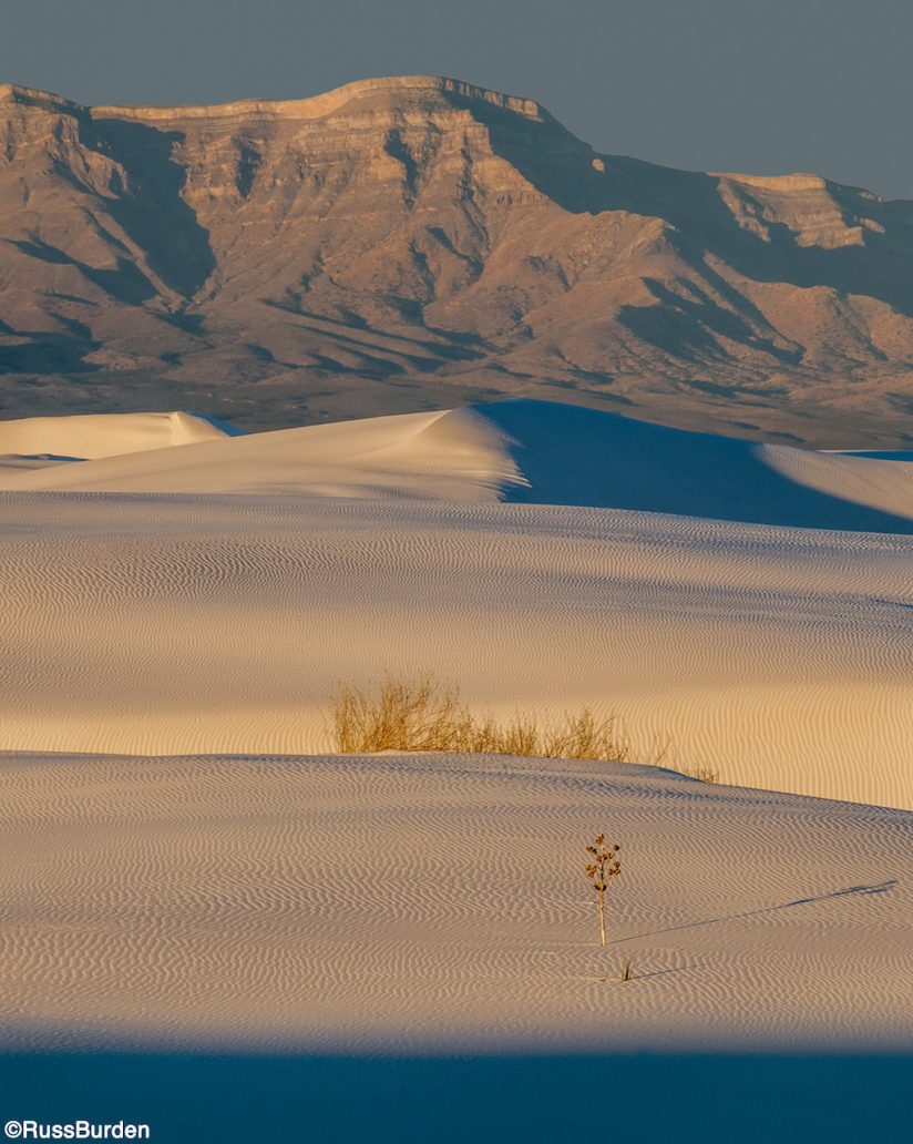
What makes a photograph of texture a good one? If you want to reach out and touch the picture to see how it feels, the image deserves recognition. If the picture prompts you to think of words such as coarse, soft, bumpy or cracked, it deserves recognition. If the picture has many tactile qualities along with three-dimensionality, it’s a winner. From macro subjects to sweeping vistas and landscapes, great images of texture abound.
Texture in a subject is best revealed when strong light obliquely skims across it and creates shadows and highlights. Sunrise and sunset are the best times for this. During mid-day, the light is flat and adds no dimensionality to the surface of an object. Flash can be used to extend shooting time if it’s powerful enough to be used as an off camera main light. Hold the flash to the side of the subject to make textures prominent.
Black & White vs. Color
Black and white interprets all it sees in tones of gray. The more extreme these tones become, the more effective the pattern or texture. As the contrast between the bright whites and deep blacks increases, more shape is inferred. When the light is hard and rakes across the subject, convert the file to black and white. This very contrasty light brings out texture. Deep shadow areas are juxtaposed against bright highlights. As the light reaches out to grab the outer edges of the subject, the abstract quality of what’s photographed is emphasized.
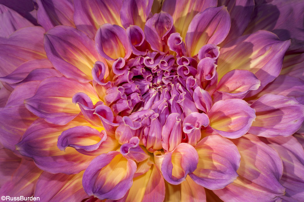
In comparison, contrast levels between colors within an image can produce powerful results. This contrast can be accomplished a number of ways. Warm tones can play upon cool colors, strong ones can be complemented by pastels, a single color can stand out against a field of opposites or they can clash in a whirlwind of abstractions.
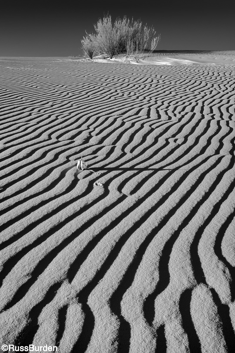
Patterns of color can be balanced or random. Fields of flowers that zig-zag in a specific path, a set of waves with upturned crests or close-ups of a peacock’s feathers are great examples of balanced patterns. A great example of a random one is ripples of a dried-out stream bed.
One advantage color has over black and white is it communicates mood. Warm tones excite an individual while cool tones have a calming and sedating effect. Reds, yellows, oranges and pinks imply liveliness, stimulation, agitation, anger, eagerness and passion. Blues, greens and purples evoke feelings of tranquility, rest, serenity and comfort.
To learn more about this subject, join me on a photo safari to Tanzania. Visit www.russburdenphotography.com to get more information.
The post Shapes, Lines, Patterns And Textures in Nature, Part 2 appeared first on Outdoor Photographer.

