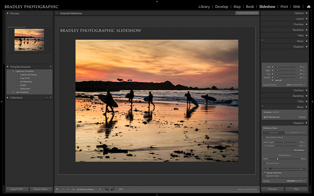
Figure 1. Sharing your work doesn’t begin and end with exporting individual images. Think about sharing sets of images or portfolios with Lightroom Classics Slideshow and Book Modules.
These days, social media has become the most popular way for photographers to share our work. It’s an addicting feedback mechanism that has allowed artists to build audiences in new and exciting ways. I also suspect that most of us use similar sharing workflows. Speaking generally, I’ve picked a resolution for my JPEGs that I use for almost all the images I export out of Lightroom, I use a watermark when appropriate, throw in a little output sharpening, and that’s the bulk of what I do. Sound familiar?
Still, there are additional applications to consider and other reasons for sharing. For starters, not all imagery is intended to be shared as individual photographs. In fact, many of you may shoot for a project, essay or theme where your images are intended to be presented as a portfolio. Some of you may want to present your work in front of a live audience, to clients who have hired you for a job, or to individuals interested in sifting through your work to buy prints. Sharing your work can, and should, go beyond simply exporting for “likes” on social media.
In this final installment on sharing your work with Lightroom Classic, I’ll walk you through the basics of alternative ways to showcase your best images. If you’ve been following along, you know we’ve gone step-by-step through how to export photos from Lightroom Classic, what formats to choose and why, how to resize, how to sharpen, set your resolution, add watermarks, and even automate the whole export process. Now we’ll wrap this series up with a discussion of how to create slideshows, export videos from those slideshows and export PDF portfolios using either the Slideshow or Book Modules.
Exporting From The Slideshow Module
Slideshows are a versatile way to present portfolios of work for all kinds of applications. You can create slideshows with small sets of images and manually move from one slide to the next, or you can create slideshows with large portfolios where the images move quickly and automatically along a timeline that can synchronize to music. You can include captions, filenames and watermarks. You can control the color of your slideshow’s backdrop or even have a tonal gradient behind your images.
The list is long, and there are plenty of options to stylize, but that’s not all. You can export your slideshows as videos that can be uploaded to your website, YouTube, Vimeo or anywhere else that hosts videos. You can even export your slideshows as PDFs that your clients can browse through in full-screen mode on their computers or devices. Let me walk you through the Slideshow Module to provide a feel for the many options available.
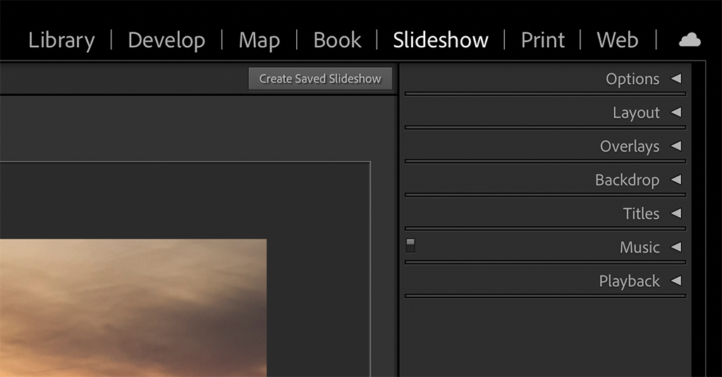
Figure 2. To stylize your slideshow presentation, you have seven panels on the right side of the module.
There are seven panels on the right side of the Slideshow Module, as shown in Figure 2. You should get familiar with these panels to stylize your presentation. Going from top to bottom, first is the Options panel with its three sub-panels. Each sub-panel has its own checkbox to activate it. You can Zoom to Fill Frame, add a Stroke Border to highlight the edge of your photos, and Cast Shadow on the border to add some depth to the edge.
Next is the Layout panel. The sliders in this panel allow you to control the margins between the edge of your image and the edge of the canvas. You can create a border around your images that you can add color or a color gradient to, or you can fill the frame. On the bottom of the panel is an Aspect Preview where you can change your canvas from Screen to 16:9 and 4:3. Do note that 2:3 is not an available option, and most people shoot 2:3 or 35mm format. So, even if you zero out all the sliders with a 2:3 aspect ratio image, you will never be able to fill the canvas with that image. If that’s a must for you, you’ll have to crop your image to one of the available aspect ratios. I’m baffled why Adobe doesn’t offer this option, but such is life. Lastly, there’s a checkbox at the top to Show Guides, but I suggest leaving that unchecked as it adds lines to your canvas.
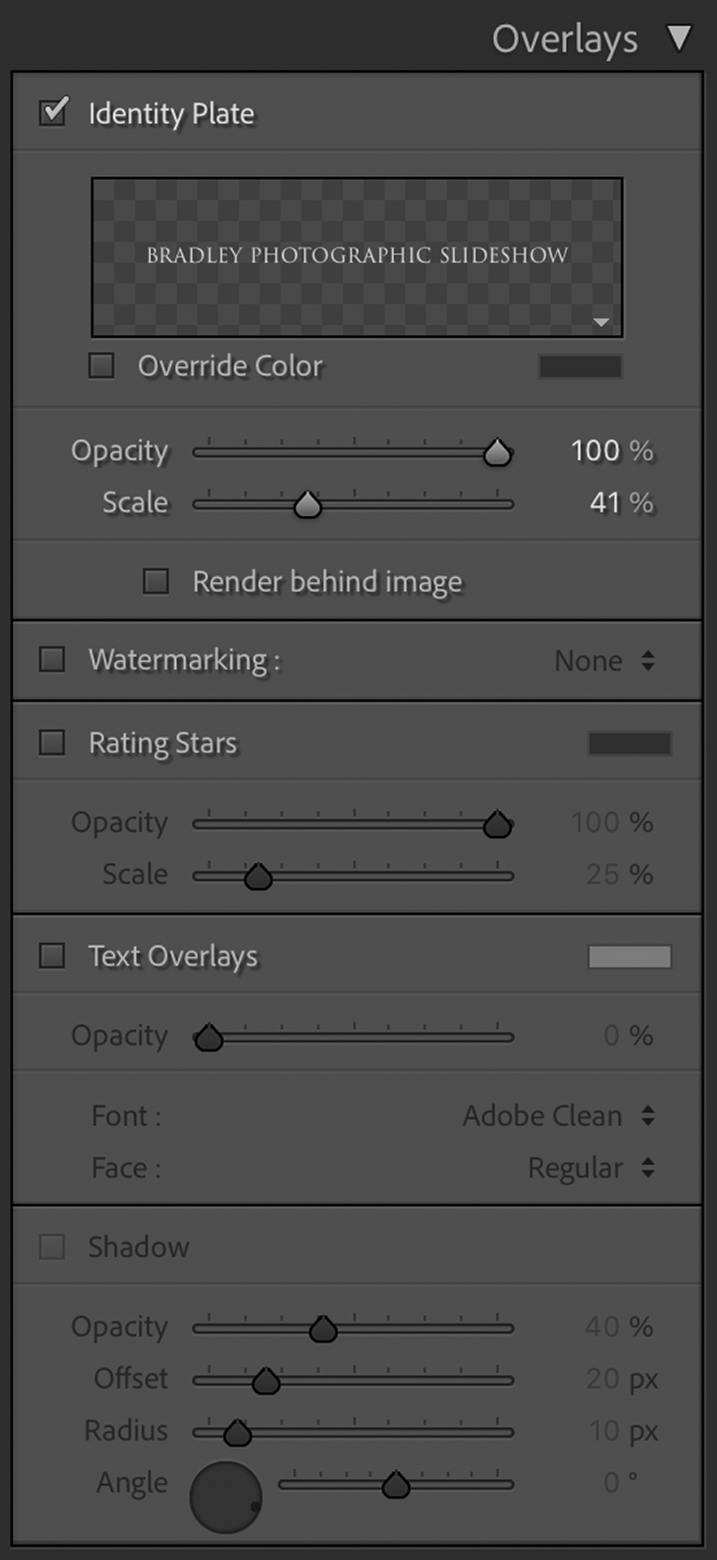
Figure 3. The Overlays panel allows you to choose between a variety of overlays such as Identity Plate, Watermark, Rating Stars and Text Overlays.
Third is the Overlays panel, which consists of five subpanels, as shown in Figure 3. You can add an Identity Plate. You can add a Watermark that will appear on all the images in your slideshow. You can overlay the Rating Stars that you have set for your images. You can add custom text, and you can add drop shadows to that text.
Following is the Backdrop Panel as shown in Figure 4 below. Here you can add background colors or color gradients to your slideshow’s canvas. To add a gradient, you’ll need to select a background color first. Next, create a Color Wash tone and then control what side of the background that color shows up on by playing with the Angle slider. If you don’t want a gradient, simply leave the Color Wash checkbox unchecked. If you leave both the Color Wash and the Background Color boxes unchecked, the default color is black.
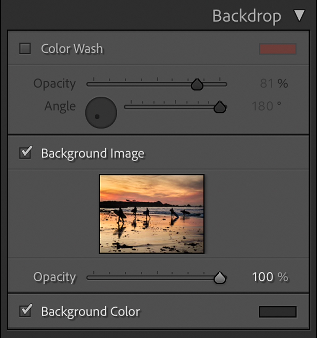
Figure 4. The Backdrop panel allows you to control the color of your background, or you can add a background image.
The Titles panel allows you to add title slides to the beginning and the ending of your slideshows. As handy as this panel is for the typical slideshow, there are many instances where it doesn’t work well, so I personally don’t use it. For example, some slideshows you create to run automatically, and they may have slides moving too quickly for a slide you want your audience to read and take in. Considering you have no control over how long the title and ending slides linger, fast-moving slides then mean fast-moving and unreadable title slides. Additionally, I have a company logo and much prefer adding an image with my logo to the slideshow. Of course, you also don’t have control over how long a logo lingers, but I have a hack for that. If you right-click on a logo slide (Windows) or Control-click on a slide (Mac) to bring up the contextual menu, you can create a Virtual Copy of your image. So, instead of just rolling through one image of a logo, roll through two, three, four or however many you need to create the timing you desire (see Figure 5).
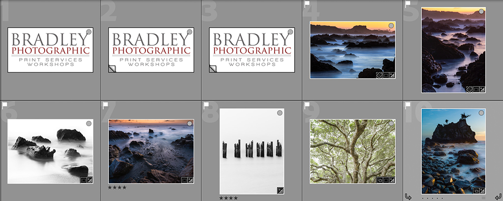
Figure 5. When you are running slideshows automatically, Lightroom-generated title slides don’t always cut it. Instead, I add my logo as its own slide in the show and create virtual copies, so it stays on screen longer than the rest of my slides.
The last two panels are the Music and the Playback panels. The Music panel is simple. Just hit the + symbol and select a music file from your computer. You can add up to 10 tracks. How that music plays with your slideshow is set in the Playback panel, as shown in Figure 6. This panel begins with the choices of Automatic or Manual. By choosing Manual, you can manually advance your slides from one to the other.
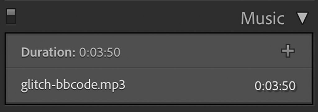
Figure 6. The Music panel is simple. All you need to do is click on the + symbol and find the track or tracks you want to add to your show. You can add up to 10. The Music panel is simple. All you need to do is click on the + symbol and find the track or tracks you want to add to your show. You can add up to 10.
If you want your slideshow to run automatically, just hit the Automatic button. Working in Automatic mode (Figure 7) offers an option to synchronize your slides to the music you selected, or you can fit your show to the same music. What’s the difference? Let’s say you have music that lasts 1 minute, or 60 seconds, and you have 20 images in your slideshow. If you Fit to Music, then Lightroom Classic will automatically set the Slide Length slider for you. Alternatively, if you Sync Slides to Music, then Lightroom Classic analyzes your music and advances the slideshow to the cadence of the music you’ve selected.
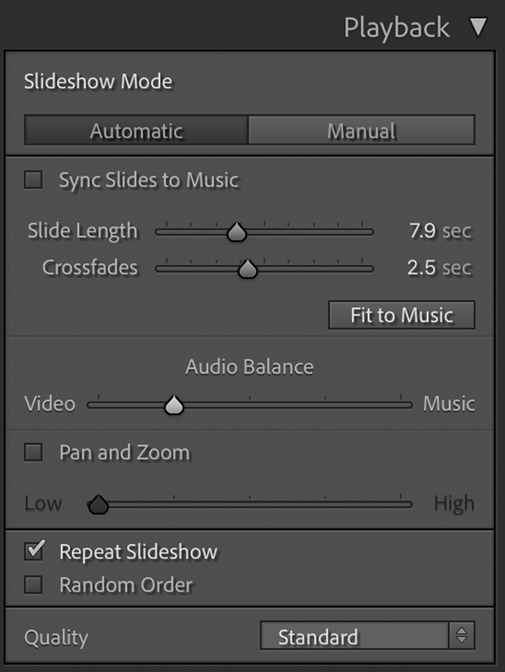
Figure 7. A lot happens in the Playback panel. You can control your music tracks, how long your slides play, the duration of the transitions between slides and much more.
You can also control the length of time you can show each slide, how long it Crossfades between slides, the Audio Balance between the Music and the Video, Pan and Zoom, whether or not you want the show to repeat or show images in a random order automatically, and, finally, the Quality of the show.
Previewing & Finalizing Your Slideshow
Once you’ve stylized your slideshow to look just the way you like, there are a few paths you can take. At the bottom of the side panel are Preview and Play buttons. Why are there two options? The Preview button is great for seeing a quick preview of your slideshow without the need to wait for the whole show first to render. For example, if you’re playing with the settings and want to test how things look before rendering your whole show, the Preview button offers a low-res version to see how things are working first. Once you’re satisfied with the look, hit Play.
Exporting Slideshows As Videos Or PDFs
In addition to simply playing your slideshow, you can also export your slideshow as a video or a PDF. First, look to the lower left corner of the Slideshow Module’s user interface. There you can find two buttons: Export PDF and Export Video. Clicking on Export Video will launch the Export Slideshow to Video dialogue, as shown in Figure 8 below. Starting from the top of the dialogue, you can name your new video and add keywords or Tags, which will help people find your video through Google searches if that’s of interest to you and you’re posting your video on the web. Video Preset is where you set your video’s resolution or quality. For better or worse, you can only create videos as large as 1080p. Unfortunately, there is currently no 4K option.
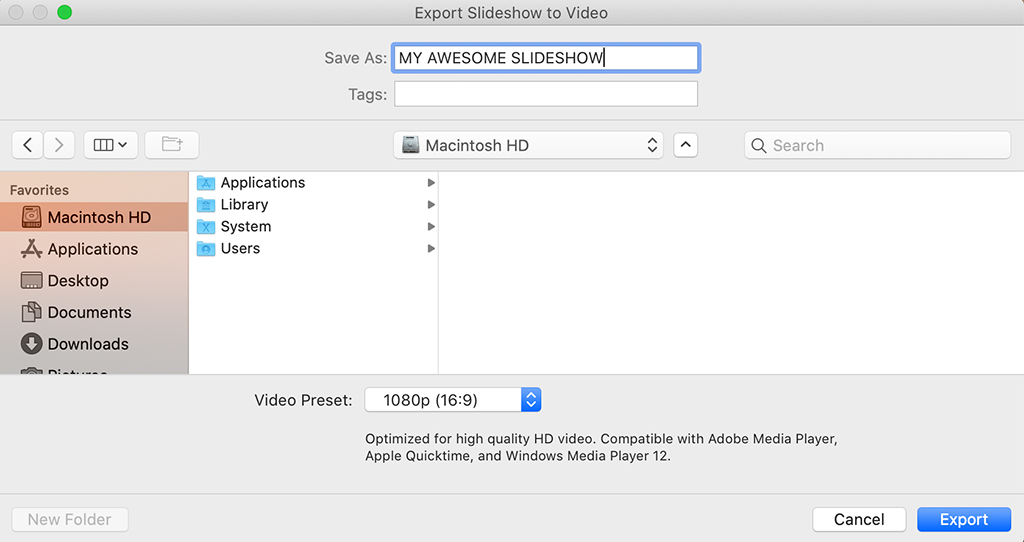
Figure 8. You can export your slideshow as a video. Click on the Export Video button in the lower left corner of the Slideshow Module to launch the Export Slideshow to Video dialogue.
Pro Tip: If you intend to create a slideshow that will be exported as a video, note that all the exportable resolutions have a 16:9 aspect ratio except the 640×480 option, which is 4:3. Do keep that in mind when you are stylizing your slideshow in the Layout panel. As mentioned before, you can set your canvas’ aspect ratio in the Layout panel.
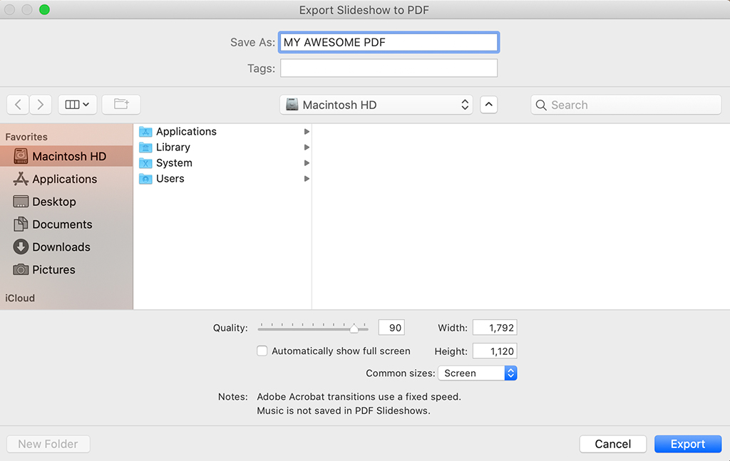
Figure 9. To export your slideshow as a PDF, look to the lower left corner of the Slideshow Module and click on Export PDF to launch the Export Slideshow to PDF dialogue.
If you click on Export PDF, you’ll launch the Export Slideshow to PDF dialogue, as shown in Figure 9. The top part of the dialogue allows you to Save As a name of your choosing, enter Tags to help with searchability on Google, and determine where you want your PDF saved on your computer. With the remainder of the dialogue, you can configure the settings for your PDF. You have a Quality slider, a checkbox to show full screen Automatically, and the ability to set the height and width of your final export.
The Quality slider is something I would suggest to use as needed. I tend always to leave it at 100% unless I have a specific need to reduce the size of my final document. If I do need a smaller document, and I can’t reduce the size by adjusting the width and height in this dialogue, then adjusting the Quality can help.
The option “Automatically show full screen” is kind of self-explanatory. I almost always use it, and it makes for a very nice cinema-like experience for your audience when they open the PDF. Without that box checked, those receiving your PDF will have to manually switch to viewing the portfolio full screen on their device.
When choosing the height and width of your PDF, note that there is a dropdown menu for Common Sizes to choose from. However, these sizes are all 4:3 aspect ratios, so do keep that in mind. Most of you, I suspect, shoot 35mm format or a 2:3 aspect ratio. Thus, if you want your background canvas’ aspect ratio to match your images, then you’ll need to add a custom number to those boxes.
Sharing PDFs From The Book Module
For a more polished look to your PDFs, visit the Book Module instead of Slideshow. Obviously, creating and printing books is another great way to share your work, and the Book Module is an easy way to create all kinds of looks and styles for your printed masterpiece.
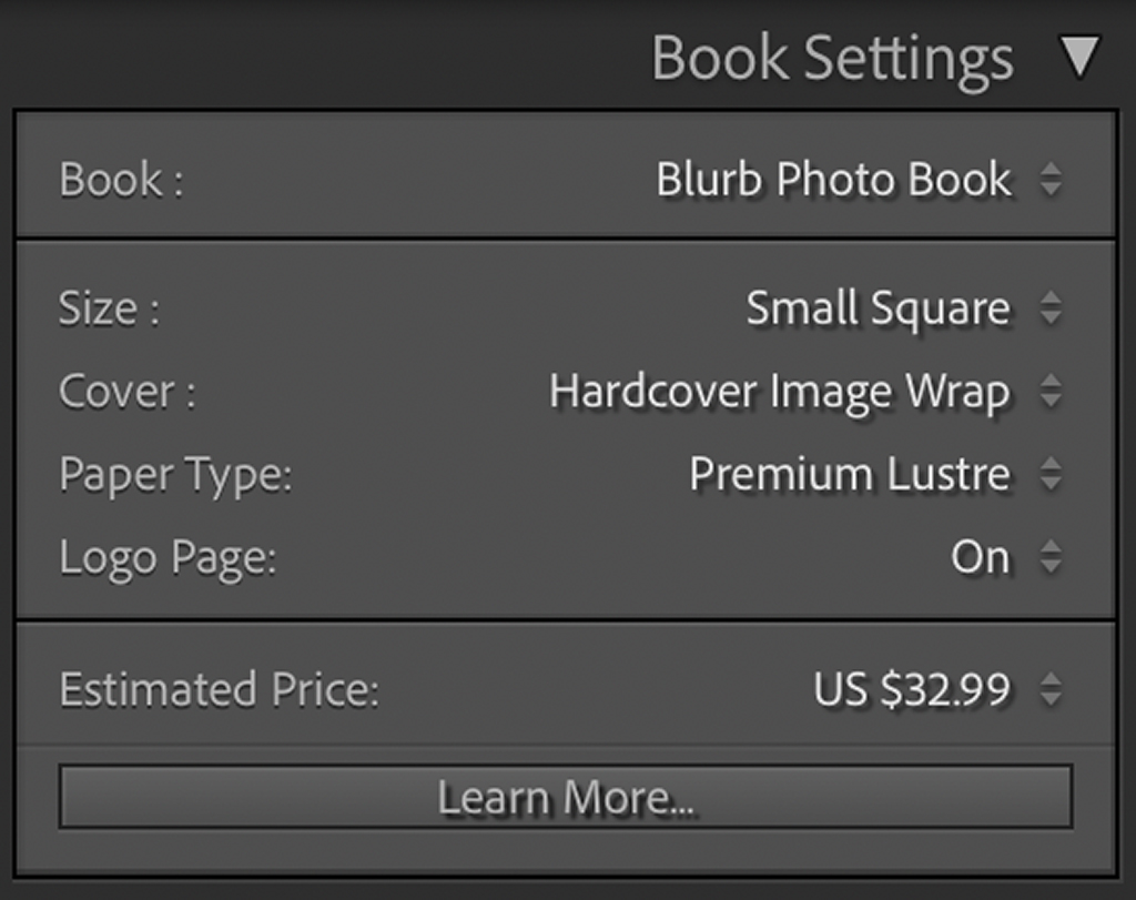
Figure 10. Multiple options are available in the Book Settings panel.
Without walking you through the whole module, just look at the Book Settings panel in the upper right corner of the user interface, as shown in Figure 10. Starting with the Book dropdown menu, you can choose between creating a layout specifically for a Blurb Photo Book, Blurb Magazine, Blurb Trade Book, PDF or JPEG. Next, under Size, you have an assortment of different aspect ratios and sizes to select from. You can create layouts with as many images as you like, creating large or small portfolios, and the stylistic possibilities are just as endless.
Doing the actual export to PDF is simple. If you’ve first selected to create a Blurb Photo Book, Blurb Magazine or Blurb Tradebook, and you’ve chosen a Size for your book, then you simply look to the bottom left corner of the Book Module’s user interface and click on Export Book to PDF. There is no further dialogue for you to configure sizes or quality of output as that’s already done ahead of time in the Book Settings panel. Simply name and save your PDF, and you’re done. Alternatively, if you’ve first selected to create a PDF, then look to the lower right corner of the user interface to Export Book to PDF.
Creating Art Is Not Enough
I presume we are all familiar with that old question about the tree falling in the forest. If it falls and no one is around to hear it, does it make a sound? To think of it another way, what is the value of sound, if it’s not perceived? Comparatively, what is the value of art if not shared?
That doesn’t mean sharing art is easy, as it requires taking risks. Sharing demands that you reveal who you are as an artist, how technically inclined you are, your sense of style, and your ability to use your camera as a tool to translate your voice. These are all very personal things. To share, you must be, on some level, vulnerable in front of your friends, family, peers, colleagues, clients and strangers.
Here’s something else to consider: There is no reward without risk. I suggest being vulnerable. Put yourself out there. If you do, you’ll get feedback. You’ll gain insight into what parts of your work people connect with and which of the images you’re creating have impact and begin to understand how others are interpreting what you’re trying to express through your work.
And as we’ve touched on in this article series, we have so many ways of doing that today. From websites to social media, the slideshows you create, books you lay out and the PDFs you export, the myriad options available today offer a profound set of choices to connect with audiences and show our work to clients in ways never before possible. The more you do it, the more opportunities you’ll have to grow and evolve your craft.
The post Sharing Your Photos, Part 4 appeared first on Outdoor Photographer.


