I love shooting for black and white.
Notice that I said “shooting for” black and white. I’m consciously aware that the image that I’m making at that moment will end up being a black-and-white image, except for “bonus black-and-whites” that I find after the fact (see my “confession” below).
This means that in the time I’ve used to prep and set up for the image, my brain has already run through several important pre-calculations, some of which are used for any image — both color and black and white — and some which are especially important for black-and-white images:
Considerations For Shooting In Either Color Or Black & White
- Is this a compelling image and subject?
- Do I have light?
- Is the quality of light good?
- How will I compose this image?
- What focal length will I be using?
- What is the best depth of field for this image?
- Do I need any filters to bring out the best in this image (polarizer, neutral density)?
Important When Shooting For Black And White
- What is the contrast of the subject relative to the scene?
- Where is the tonality contrast?
- Where are the differences in luminosity (brightness)?
- Are there “micro-scenes” within the composition that might act as supporting players?
- Will the sky and clouds look better in black and white?
- How can I maximize the contrast of the entire image as a whole?
- Does my background need to be sharp and in focus, or is it better to be soft?
- Have I composed in such a way that my subject is supported by the background, not diminished by it?
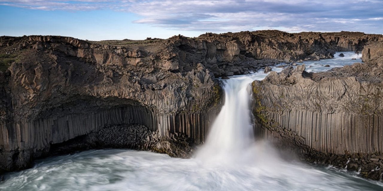
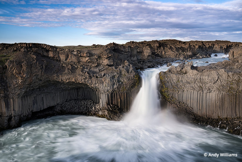
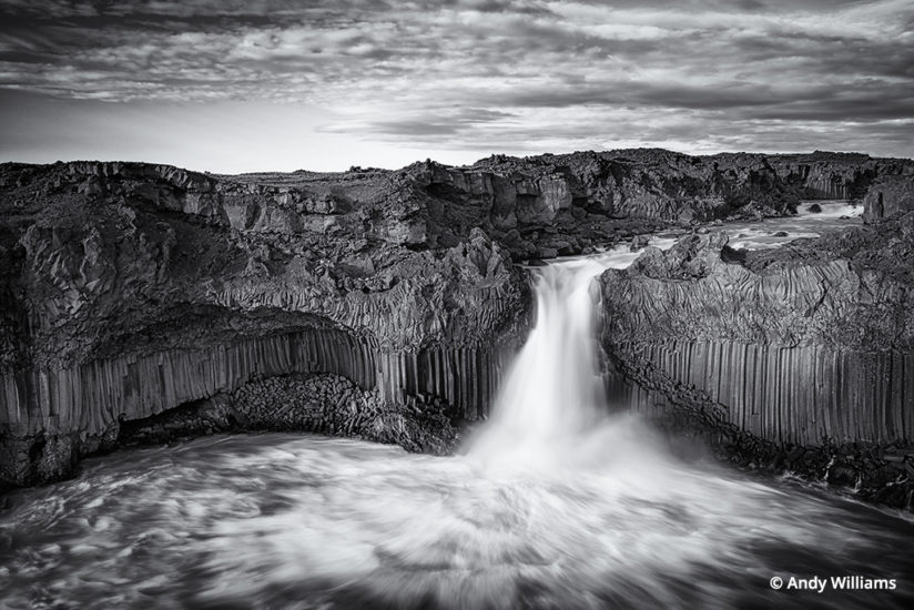
Let’s take my image of the Aldeyjarfoss waterfall in North Iceland (above) as an example. This waterfall is situated in such a way that late afternoon light floods the canyon. We usually shoot it from a few hours before sunset, and sometimes the sky will light up with crazy colors at the magic hour. It’s a compelling image and subject, there’s good light—I now have to choose how I’m going to compose. There are a few limitations, few spots to shoot from, since climbing down to water level requires some skill and can be treacherous. Depth of field? Everything that is “rock” needs to be sharp. Filter? I’m a sucker for long exposures to show the movement of the water, so I used a six-stop neutral density filter to get myself to a 1.3-second exposure in very bright light. So far, so good, and the result is a successful color image. But that isn’t what I was aiming for at all.
Compare the color version to the black-and-white, and look at the major and minor contrast differences: the creamy white flowing water against the stark sharpness of the basalt columns and rocks; the clouds become so much punchier in black and white, adding another “micro-scene” of dramatic contrast; finally, black and white shows the luminosity contrast of the rock formations in a stronger fashion, in particular the bold lines of the basalt columns that ring the pool below the waterfall. From the moment I first arrived on the scene, my “computer” was thinking all of this stuff through.
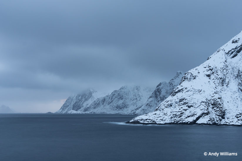
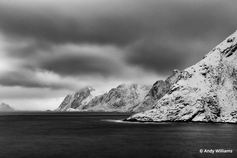
Another example is my image of the seacoast taken at the town of Å (that’s not a typo), which is on the southern tip of the Lofoten Islands of Norway. I didn’t have all of the ingredients that I listed above but most of them. The light, in fact was dismal. Still, the scene spoke to me, and I thought I could pull it off, and this photo shows what you can accomplish even in not-so-perfect light with careful exposure. I exposed way to the right, making sure I got everything as well exposed as possible without blowing the whites out. Right from the start, I was shooting for black and white, as that is nearly how the scene looked to my eyes during this dismal weather. The water in the sea was whipping around fairly well, and I pictured smooth water in my mind contrasting with the sharpness of the volcanic mountains that reach the water. So, a long exposure was in order. A 10-stop neutral density filter let me get to the 15-second exposure that I judged to be the right amount to give smoothness to the water. So at shoot, many of my objectives were met, namely the macro contrast, the scene-to-scene contrast (smooth water versus rough mountains), and the drama contrast (the sky). A little careful developing in Lightroom—nothing fancy here—and the image was done.
Basic Black-And-White Processing
Let’s talk about what happened in Lightroom. As much as I “think” and “see” in black and white, there’s no doubt that a lot of what goes into a successful black-and white-landscape happens in post-processing. This is no different today with digital than it was back in the days when we shot film and spent hours dodging and burning our favorite prints.
In Lightroom, for this image, it was pretty simple: A quick touch of the tone-curve to extend my tonal range all the way left and right, maximizing the blacks and the whites, and then an adjustment brush on the clouds with a mix of Contrast, Blacks down, Whites up and adding some Clarity. Sometimes a (very) little Dehaze filter can do the job as well. It varies from image to image; what I’m after is to accentuate what is there, and make it as punchy, contrasty and dramatic as possible.
Next, a different brush for the mountain and snow, further pushing the Blacks, Whites and Highlights in that area of the image to the limit. Mixing in a bit of Clarity helps out here. It really works well in those midtones. The idea is to have one of those areas of “micro contrasty scenes” within the photo.
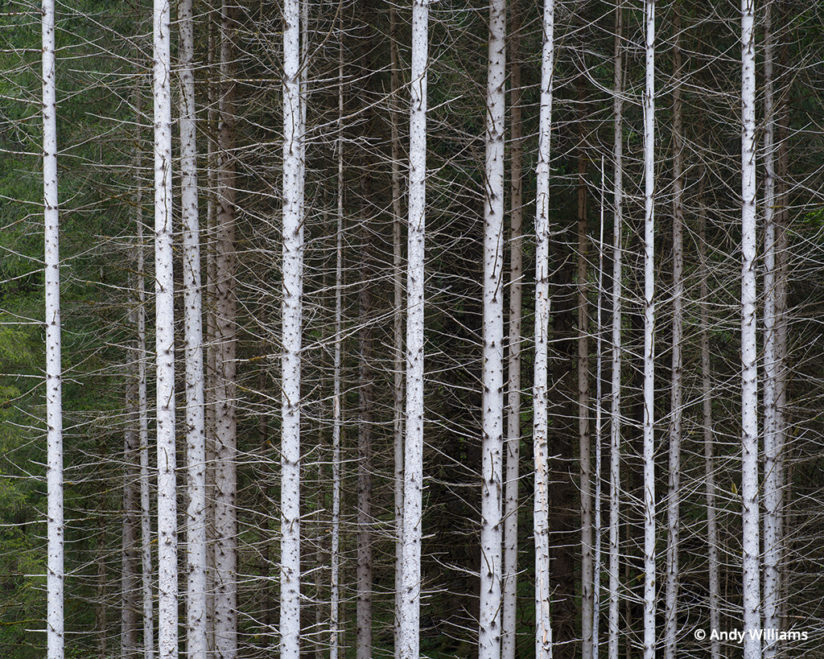
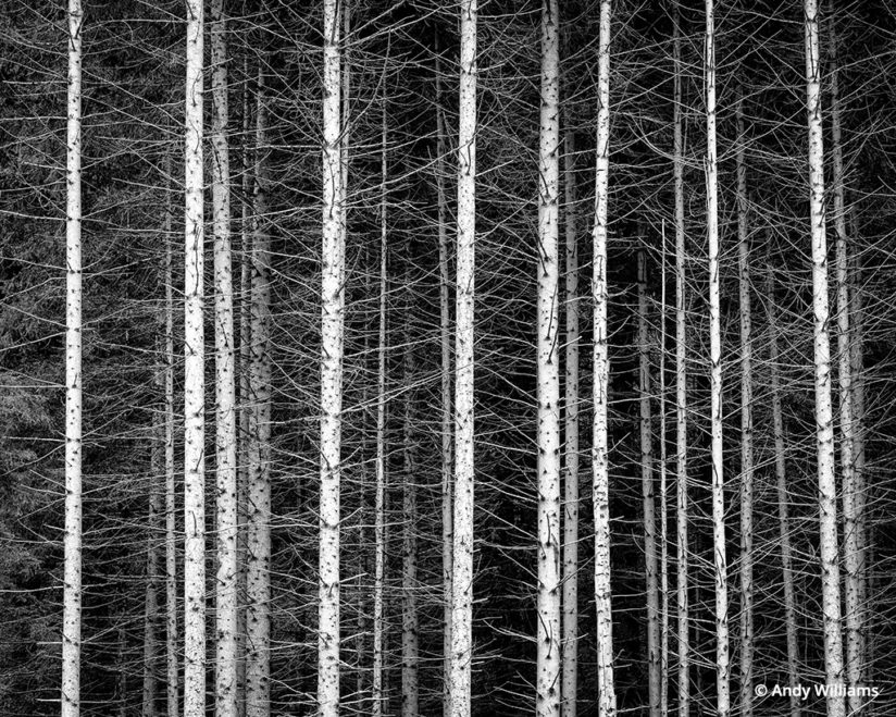
When I’m “seeing” in black and white, I’m looking for patterns and textures as well. These are very important ingredients to a successful image. When I came upon a stand of trees in Italy’s Dolomites, I immediately thought “black and white.” Why? There was virtually no color in the scene to begin with, the outer trees were bathed in soft box-like, high overcast light, showing their white bark, and the rest of the forest stand was in shadow. I immediately fell in love with the pattern of the strong vertical lines of the trees, and the texture of the fine leafless branches reaching out from one tree to the next, each contrasting mightily with the much thicker white trunk of the tree.
Tonality, Luminosity And “Micro-Contrast” Scenes Within The Photo
Most times that I have photographed the giant crater at Mývatn, in North Iceland, it is either fully covered in pure white snow or it is completely devoid of snow, and in either of those conditions, while still an impressive and beautiful scene, it is hard to see anything but just the general shape of the caldera. When arriving in the area after a long drive, I made the immediate decision that we had to photograph the crater now, soon, before things changed. Why? There was a low cloud bank and good sunshine above the clouds, so we had that soft box-like lighting effect happening—great quality of light. I could see with my eyes that there was just the right amount of snow on the crater that I would be able to really emphasize the contrast, texture, repeating lines and shape in a very good way.

The scene in color was already very “blendy,” meaning that the color tones shifted so gradually as to not provide much change in color contrast at all. The sky was very neutral blue-gray, with not much detail to the naked eye. Finally, the foreground was mostly low birch bushes and trees with no leaves, and while it is important to have an “anchor” to the photo, it would be a supporting player. Still, I noticed that there would be areas of micro-contrast in the foreground and that there was “texture” contrast (sharp tree branches, then the smoother crater), so I knew that black and white was going to be my result.
You have to get it right at capture. I set up for a panorama—this is 10 shots, portrait-oriented, shot left-to-right and stitched together in Lightroom. I made sure that my exposure was as perfect as could be, protecting the shadows and the highlight, but pushing it as much as possible to the right of the histogram.

Once the images were stitched in Lightroom, I had an overall very easy time post-processing this image. Believe it or not, I just hit the “V” key in Lightroom to toggle the image into a quick black-and-white on screen, then I added Clarity, pushed the Whites and Highlights as far as I could to the right, added a gradient filter for the sky, reducing the Blacks, upping the Whites and Highlights even more, and then added a touch of Dehaze. Finally, Sharpening was applied to give the absolute separation of the crater edges and the rivulets of snow and the white trees trunks from the black tree trunks—and done.
Confession: The Accidental Black And White
I admit, there are times when I’m reviewing my images and I will touch that “V” key in Lightroom to toggle the image into black and white. Sometimes, I get that instant “wow” for an image that I was never planning to be a black-and-white. What is it that makes me do the change?
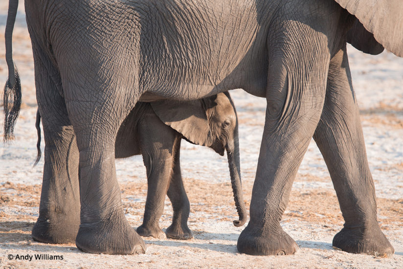
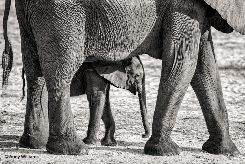
My image of a mother elephant and calf is a good example of this. When I converted to black and white, the distracting brown earth patches became almost invisible, thus reinforcing my main message here in the photo, that of the protective mother elephant and her calf. The second reason this image works better in black and white is because of the color of the subjects themselves—they are monochromatic to begin with. Black and white also exaggerates the contrasting folds and shadows in their skin, providing more drama throughout the image.
For the most part, the successful black-and-white photo doesn’t “just happen.” Pay attention to the tonality, luminosity, micro- and macro-contrast and the quality of the light. Look for patterns, repetition and contrasting textures. All of this, when taken together, properly exposed at capture and carefully processed in post, will bring you a great result.
Andy Williams is a professional photographer and photo workshop leader at muenchworkshops.com. See more of his work at andywillia.ms.
YOU MIGHT ALSO LIKE
Monochrome Vision
Why black and white is the best palette for my photography. Read now.
The post Shooting For Black And White appeared first on Outdoor Photographer.

