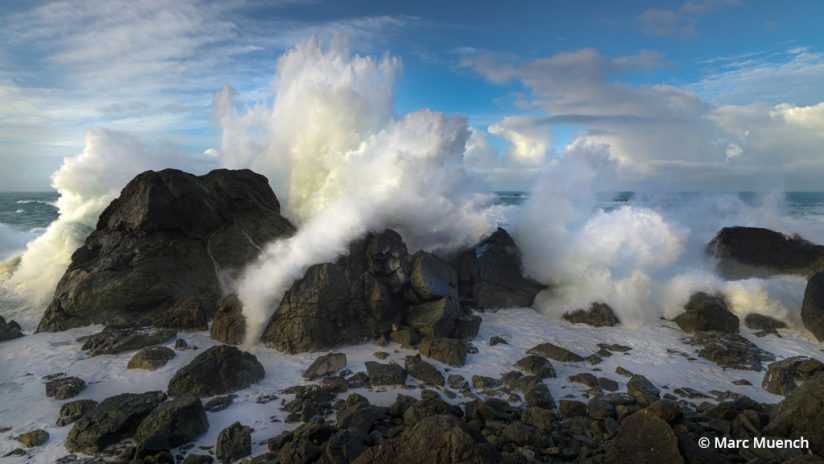
There’s a magical moment in landscape photography when you find the right position, the subject is at the correct angle, bathed in perfect light, and, with your camera in hand, you capture “The Shot.” These are the moments we all want to repeat, but for whatever reason, they are difficult to find. The more you learn about how much goes into creating such moments, the more you realize just how complex and involved they are to repeat.
This is the “Art of Seeing.”
I break the process of seeing down into three elements that I call the “creative trinity.” Subject, light and composition make up the trinity, and the fuel that fires it is timing.
In this three-part article series, I’m going to focus on the one element that deserves most of our attention: composition. Composition is the arrangement of subjects in the scene. There are many techniques to apply when making a successful composition, and there are many so-called rules that you’ve probably heard, such as the “rule of thirds.” The rule of thirds is a very basic technique to help minimize the potential issue of a boring or static composition that conveys no movement. This is just the tip of the iceberg; there are many other compositional rules and techniques to use. I refer to the rules and techniques of composition as a vocabulary. If you learn the vocabulary of composition, you’ll then have the skills to use all the various rules and techniques in your favor.
There are three basic skills you need to develop in order to successfully implement (and sometimes break) the rules of composition:
- Pre-visualize your composition, so that you will be looking for that specific subject in your mind’s eye.
- Have the technical skill with your camera to capture the pre-visualized composition in the way that best displays your intentions.
- Be well-versed in what reality may transform into after you process the image.
Develop these three skills, and you will have the ability to create many great images.
There’s no easy way to acquire all these skills, and each one has a steep learning curve. Sure, it’s possible that with no formal training, and your camera in “P” (program) mode, you could capture an amazing image that needs no post-processing, but the odds are low. If you wish to make this a repeatable process, then you will need to understand why your images were successful. Hopefully what follows will help clarify the concepts and inspire you to build on what you already know.
The Vocabulary Of Composition
If you’re new to the study of composition, a good starting point is to keep your compositions simple. Photography is an exercise in subtraction. When given the opportunity to eliminate, do it! One of the best ways to eliminate unwanted objects from your frame is to get closer to your subject. Later in this article, I will talk about “The Viewer’s Path” in detail. This is the path that leads your viewer to the subject. Help lead your viewer by omitting clutter from the path. Also, keep clutter away from the edges and corners of the frame, and be sure you have chosen your subject as the focus point.
Simplifying a composition can be as easy as moving the camera by a foot in one direction or the other to prevent a foreground object from cluttering the scene.
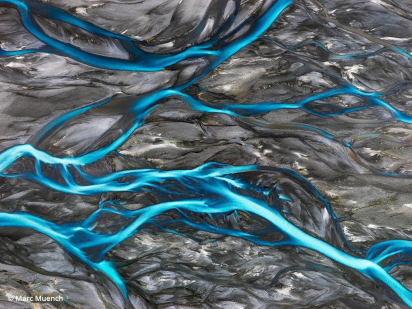
To simplify even more, I recommend you first develop your compositional skills by photographing in black-and-white mode. Create compositions in black-and-white until you have a grasp on it, then add the color. To those new to photography, this should be a common practice. There’s no need to only shoot in black-and-white all day long, but when learning and considering composition, it’s a powerful way to help train your eye. I still occasionally go back to black-and-white to help me see composition while in the field. Tip: If you want to see your RAW camera files in black-and-white while in the field but keep the color data for later editing, simply change the “Picture Control” setting (or similar, depending on your camera brand) to Monochrome. This displays a black-and-white JPEG of the image in-camera but keeps all the color information in the RAW file.
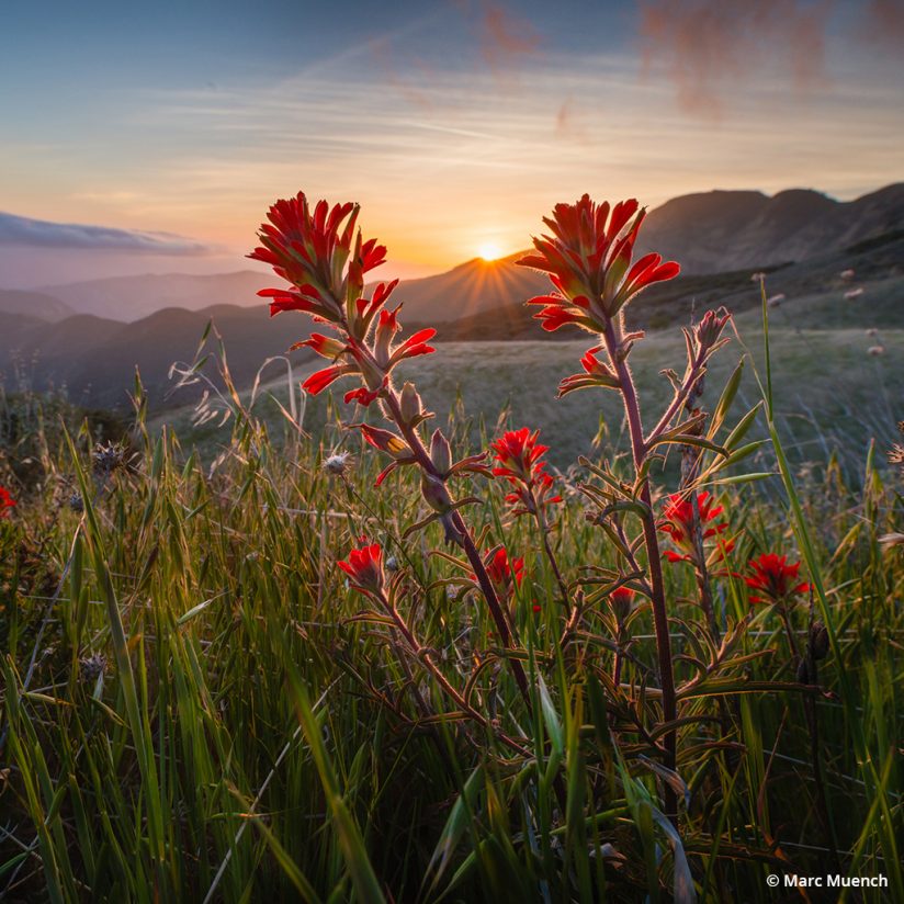
To help understand the complexity of composition, I’ve listed some ideas below. This list of compositional considerations is very helpful to me when I’m at any step of the process, from conceptualizing an image to setting up the tripod in the field to cropping on the computer. I have listed these compositional elements in an order that makes the most sense to me in the development of the image.
Subject
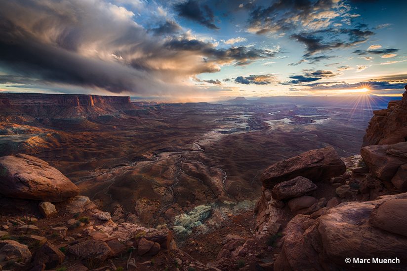
The most important of the elements of a photograph is the subject. Many will argue that light is the most important, and for certain images that is certainly true. I maintain that the subject is the most important element, and that if the subject is compelling enough, it will engage the viewer—even in bad light. There are times “light” becomes more exciting than the subject, and when this happens, it’s best to take advantage of it.
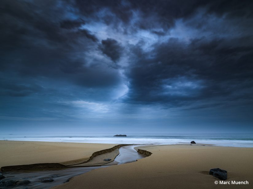
Defining what the subject is in your landscape scene will help you to compose it, light it and portray it in the best possible way.
With this in mind, finding the subject in landscape photography can be challenging, as it’s not always clear. Of course, if you’re shooting wildlife, then the subject is clear: it is the animal. But for this article series, I’m focusing strictly on landscape images.
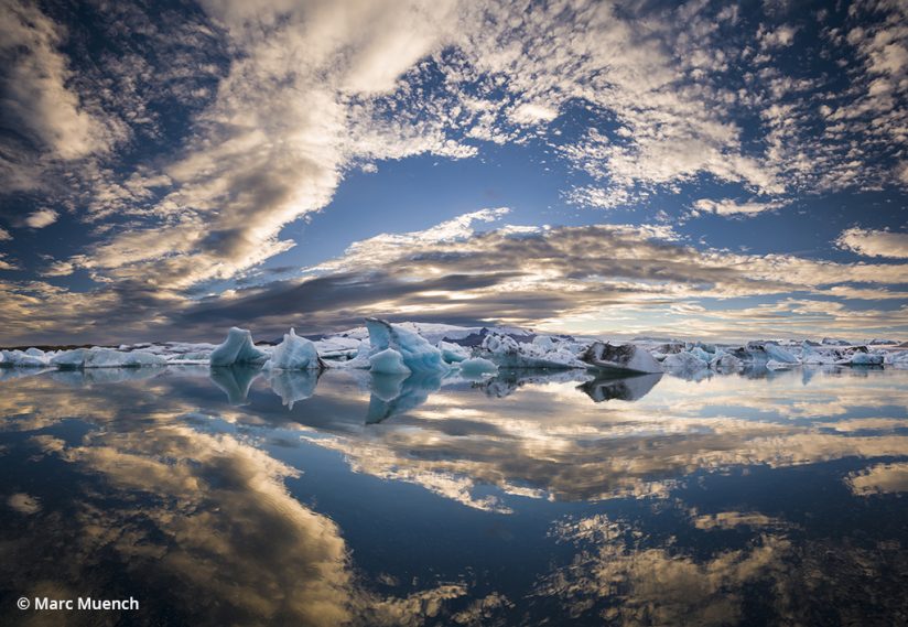
The Viewer’s Path
This is my favorite topic.
A powerful element in landscape compositions is leading the viewer along a path of discovery, either to the subject or from it. It’s not necessary for all images, but when composing and post-processing most landscape scenes, it’s my guiding concept.
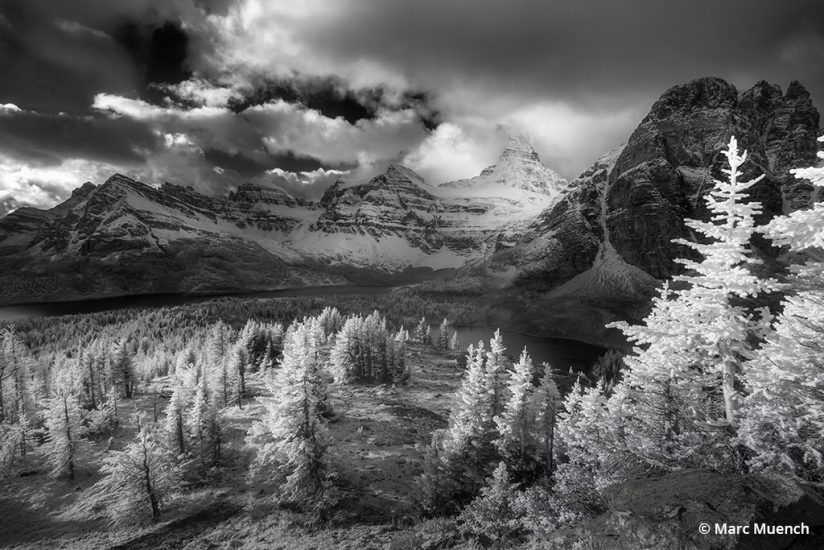
This is not done with arrows and dotted lines as we find on a highway leading us to our destination, but rather with subtle methods that a viewer might not even acknowledge at first. It’s more like a magic show, where the magicians entertain the audience without revealing their tricks.
Humans will instantly and subconsciously find an order of importance while looking at anything the first time. The predominant attraction in any scene is brightness and contrast, followed by a few other stimulants, such as primary colors, eyes and then shape. This is an instinct left over from years of survival practices, when avoiding deadly creatures and staying alive was the priority. When you consider art and photography, you must realize that all viewers will have this very same reaction to your images. There is an order of discovery in all images, some longer and more involved than others. The order of subjects we view in any scene is what creates the path, leading the viewer from the first to the last. I must point out that the main subject can either be the first read or the fourth, depending on your ability as a photographer. As a landscape photographer, you are building this path in the hopes of giving your viewer a journey.
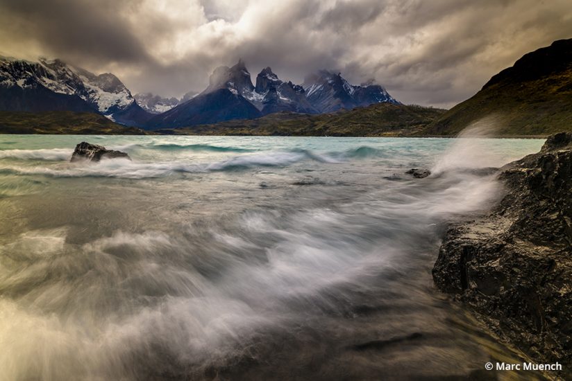
Aspect Ratio
The aspect ratio of a photograph holds more power over our perception of an image than you might think. For example, what do you think of when you see a square image?
We all know Instagram started out requiring only square images. Even though things changed and now they allow various aspect ratios to be posted within the square, what became understood fairly quickly is that square images were identified with Instagram. This was relatively recent, because prior to Instagram, all square images were associated with medium format cameras. Other associations were made in the industry as well, such as 4×5 from large format film and of course 3×2 from 35mm film. A recently adapted aspect ratio is 16×9, which is the shape of the modern display for television and computers. Of course, any of these aspect ratios can be created from any camera, so what is it that is so appealing about certain aspect ratios?
The most widely used aspect ratio today is 3×2. This can be traced back to Oskar Barnack, who was employed by Leitz Camera back in 1925 to create the format for its new handheld cameras. Previously, there were only large plates, usually 8×10 inches in size. Why has this format stuck with the industry for almost 100 years and through the transition from film to digital? It can be attributed to the fact that it’s the closest proportion to the golden rectangle.
The golden rectangle is supposedly the most pleasing proportion in nature. The proportions of 1:1.618, or approximately 13×8, are used throughout human history. A few of the examples are the Great Pyramids of Giza, the Parthenon and Stonehenge. It’s said that the Mona Lisa was also influenced by the golden rectangle.
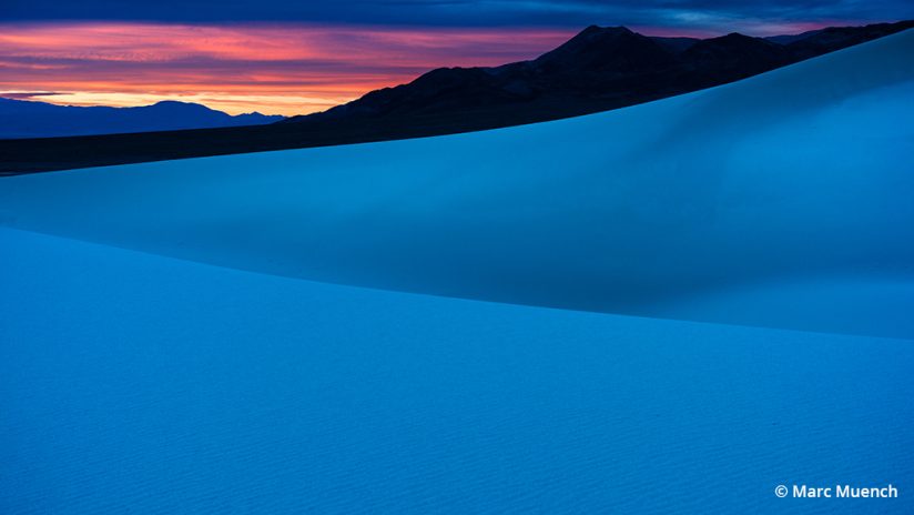
Whether you believe in the golden rectangle or not, it can be a very useful aspect ratio. The most important part of aspect ratios is finding the one that is the best complement to your image. Whether you choose the aspect ratio before you find a subject or after is not important; all that matters is that you understand that it is a powerful tool to use.
I have a few favorite aspect ratios for landscape images. For horizontal, they are 2×1, 5×4 and 16×9. For vertical, it’s 4×5. I do not always shoot for these aspect ratios, but they are usually on my mind when framing an image.
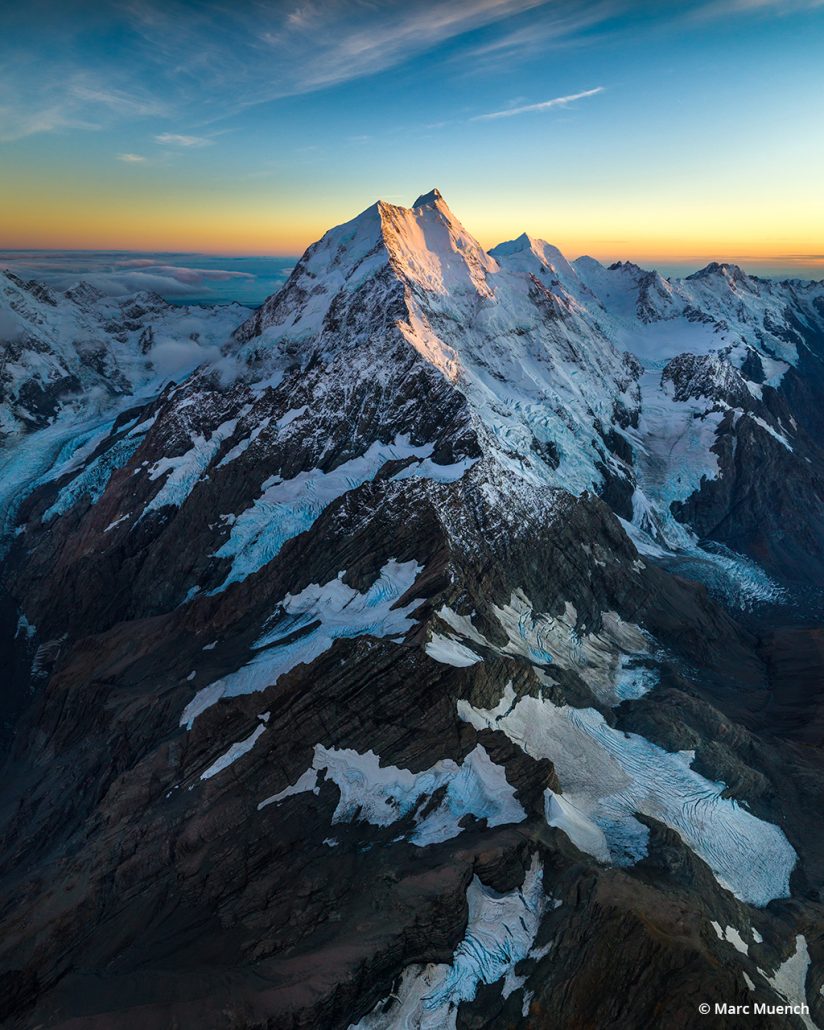
Once I locate my subject and conclude how I’m going to lead the viewer to it, I begin considering the aspect ratio. Many scenes simply lend themselves to a particular one, but it’s easy to get lazy and compose with too much slop or wasted space around the edges. There are times when, in a hurry, it’s better to take advantage of the situation and capture the image with extra space for cropping in post-processing, but for most of the situations in landscape photography, there is plenty of time to consider the impact that an aspect ratio has on your image. The post-shoot crop approach can cause other issues, too—intruding and distracting things around the edges and a loss of precious resolution.
In the next article in this series, we’ll consider additional compositional elements, including borders, shapes, line, arrangement and proportions, focus and the use of negative space.
This three-part article series is excerpted from The Art of Seeing, an ebook by Marc Muench, available as a free download at muenchworkshops.com/ebook.
The post The Art Of Seeing, Part 1 appeared first on Outdoor Photographer.

