In the first article of this three-part series, we began to explore the “vocabulary” of composition in landscape photography and considered elements of composition such as the “viewer’s path” and aspect ratio. In this article, we’ll continue with additional elements to keep in mind when framing a scene.
Borders
The edges of your image frame are very important. When peering through a camera, you may look at the subject or regions surrounding the subject and forget about the rest of the frame. As image makers, we need to spend just as much time noticing and perfecting what our viewers see around the edges of the frame in the hopes of keeping their focus and interest on the subject without letting distracting elements get in the way or wasting pixels. I like to consider the word “efficient” when contemplating the borders of my images. A good question to ask yourself is, “Are the borders contributing to the subject or distracting from it?”
Consider every pixel of your image as a valuable resource to efficiently convey the subject in the best way.
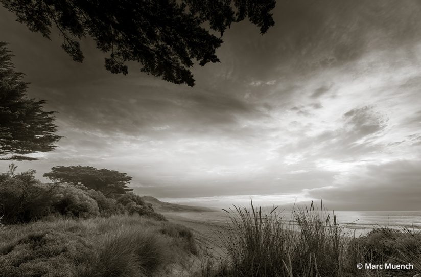
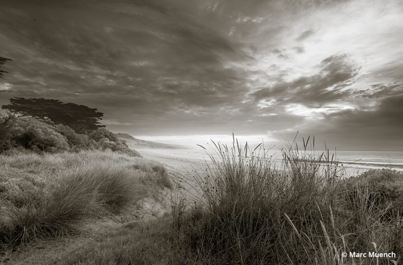
This can be a difficult task when there are so many things on your mind in the field. You could be standing on uneven ground next to the edge of a cliff while being eaten by mosquitos during a rainstorm. Of course, we don’t always have all those challenges at once, but often there are environmental conditions that become quite distracting. Just identifying the subject is challenging, then setting the camera just right to capture the accurate exposure and make the focus sharp is all demanding. This is why it’s so easy to get lazy and forget about what’s on the very edge of your frame or simply convince yourself that you can just crop later or use “Content Aware Fill” in Photoshop.
The reality in most situations is that if you take just a few seconds to actually acknowledge the edges of the frame in the composition you’re creating, you will notice the issues. Most people have the ability to see issues that distract from the subject very quickly. It’s not a complicated procedure that requires years of experience and training.
A common problem is that camera displays often get in the way of seeing the entire border of your composition. You need to turn the settings overlays off. It is very easy to tap the button on your camera to change the preview mode, commonly referred to as the “display” button on the back of the camera, until the setting displays nothing. This is usually one of three or more options that you must cycle through.
Once this is done, you will be able to study the edges of your frame more carefully, assuming your camera is on a tripod and you have turned on “Live View” or you’re using a mirrorless camera. The other option is to simply take a picture and preview it with no info showing. This, too, will allow you to see the composition in a two-dimensional view, just as your viewer will see it. It is then that your eyes will begin to notice the unintentional issues that certain distracting objects create along the edges of the frame.
Arrangement & Proportions
Before you begin looking for an image, you must understand that your point of view is extremely important. You have the ultimate power to move around through the landscape making critical decisions about which elements to portray and which elements to delete. I’ve mentioned how important it is to identify your subject first. The light is then the determining factor when deciding when to capture the image. But you must also study and understand how and why to choose the best point of view. What determines my point of view is the arrangement of all the elements in and around the subject and borders of the scene.
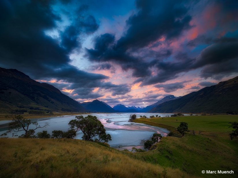
Composition of an image is made up of the subject and all the other elements in the scene. I like to call these other elements “supporting actors,” as they, too, have an important role in the story and impact of the image. The size, location and relationship these all have in your image is very important and create endless issues if not done properly. Here are just a few questions to begin thinking about what is involved.
- Should I center the main subject?
- Is it OK to crop off the bottom of a tree?
- Do I want to leave the horizon in the center of the frame?
- What if I cover up part of the subject?
- Can the main subject be smaller than the supporting actors?
There are countless elements to a landscape scene, such as rocks, trees, mountains, lakes, waterfalls and so on. Even though these elements of nature are all cemented in place and arranged by millions of years of time and natural forces, photography allows one to present them all in unique ways. One of the ways in which a photographer can alter the presentation of objects in the frame is through the use of distortion. Distortion from a wide-angle lens is a powerful way to make small objects large and vice versa. Telephoto lenses have the ability to compress subjects together.
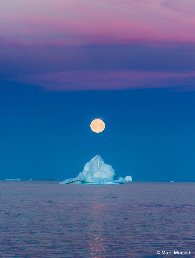
Another very important point to look for in your compositions is tangencies. A tangency is the point at which two subjects just barely touch. This is a geometric shape that immediately draws the eye, and it can be very annoying if not used in just the right way.
Shapes
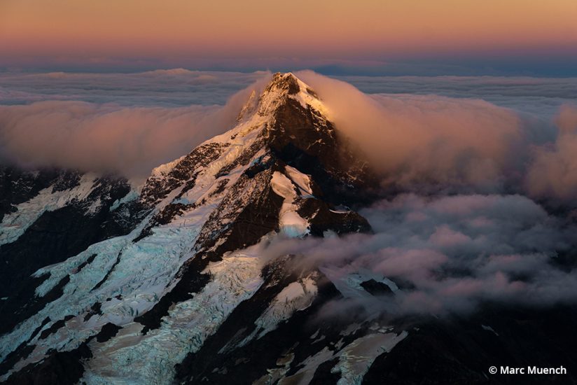
Seeing shapes in the landscape is a difficult hurdle for some but a necessary graphic tool to use when composing. Shapes help connect art with nature. There are many shapes in nature that we associate with specific things, such as a circle representing the sun. There are also many things in nature that appear to be something other than what they actually are. You’ve probably had fun looking for clowns, dogs or dragons in the clouds on a spring day. Seeing shapes of things in objects other than what they actually are is called pareidolia. This is difficult for some people and requires a stretch of the imagination.
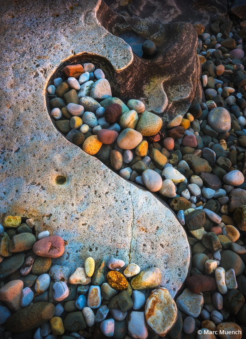
A good example is the rabbit in the face of the moon. As silly as this exercise may seem, it is actually a useful tool in understanding composition. There are two ways this works—not only do we see figures of imaginative creatures within objects but as photographers we also can see the overall shape that an object creates within a composition. When you look at a rock, tree or mountain, consider the overall shape its outline creates.
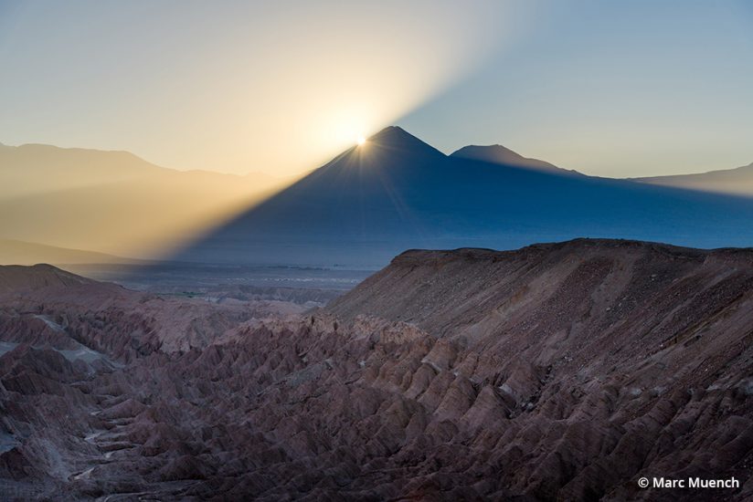
Line
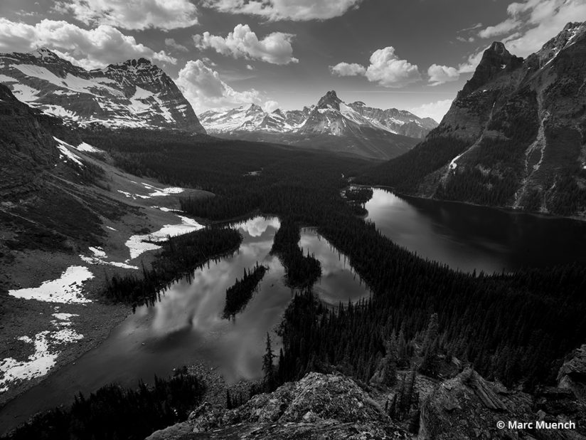
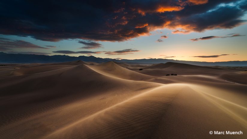
Whether a leading line, horizon line or s-curve, line is a powerful tool in composition. The leading line is the most popular use of a line in landscape photography but certainly not the only one. Just as it’s important to recognize that a rock, tree or cloud could be presented in the form of a shape even though it is just a rock, tree or cloud, seeing lines in compositions requires a similar use of your imagination. This method can be straightforward, as in using a log or shoreline to create the visual line, or it could be more complex.
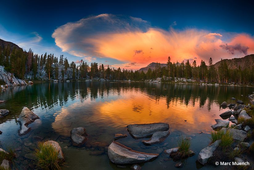
The more complex method requires imagination to visualize and is comparable to “connect the dots” drawings where you follow the numbered dots with a pencil until the image is complete. For instance, several rocks in the foreground may line up to form an imaginary or graphic line that leads the viewer through the scene. Once you recognize that these objects in a scene fall in an order, you can use them to create a visual line to provide a path for the viewer’s eye through the scene. This is a powerful way of keeping your composition from becoming static or boring.
Focus
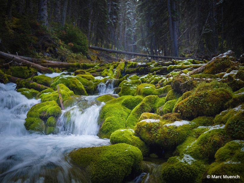
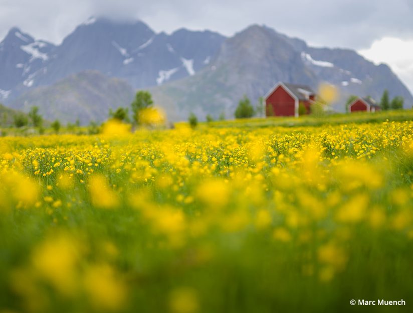
Most landscape images contain sharp focus all the way through the scene. But if you wish to separate parts of the scene in a way other than by light or color or placement, a shallow focus can be useful. You will need a lens with a so-called “fast” or large maximum aperture. A lens with an aperture of ƒ/1.4 is ideal, but lenses with an ƒ/2.8 aperture will also work for this technique. By choosing a point of focus on your subject, and leaving the aperture “wide open”—the fastest aperture of the lens (ƒ/1.4 or ƒ/2.8)—the other regions of the scene will be out of focus. When a region is out of focus, it will automatically become a second, third or fourth read. This significantly increases the odds that your first read will be your intended subject.
Negative Space
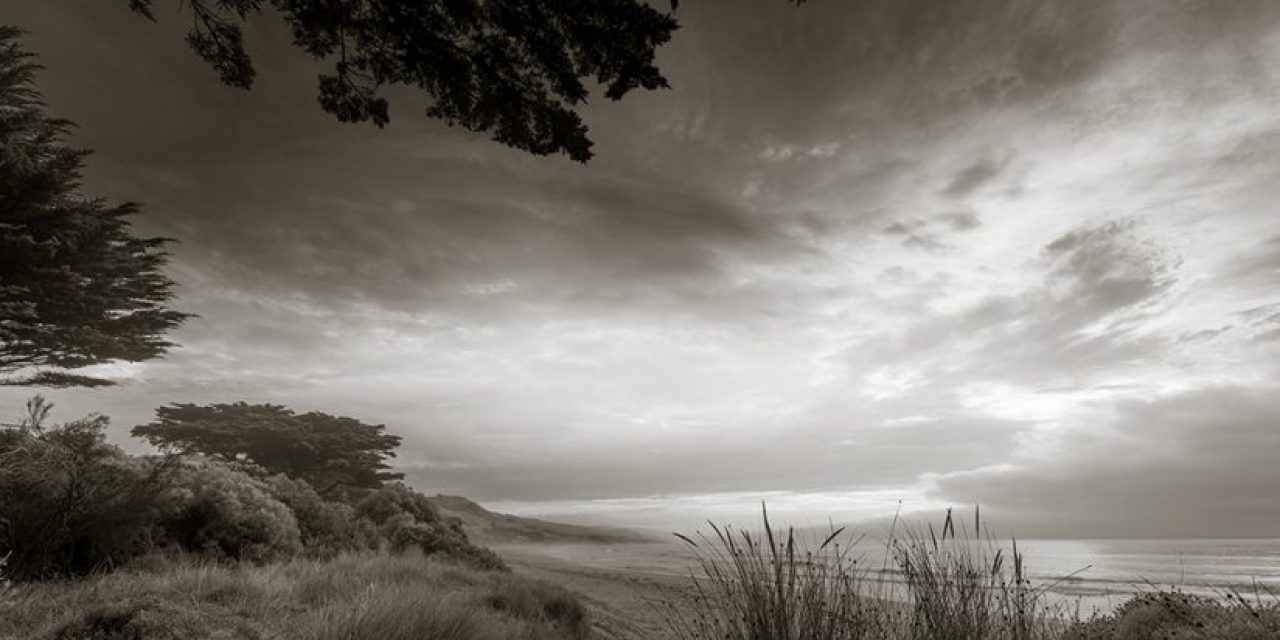
Think of negative space as the other part of the image. It’s not the subject but can be the entire surrounding, or a smaller part of the background. Whatever the size of the space, it is simply void of detail, texture or any object that forms a distinct shape. The most common negative spaces are the sky or a deep, dark shadow. When using negative space, you must first be able to notice or see it for what it is, and this is not always easy. Also consider the shape that the negative space itself is creating. Is it a circle, square or blob? Then consider how much of the frame should be given to it.
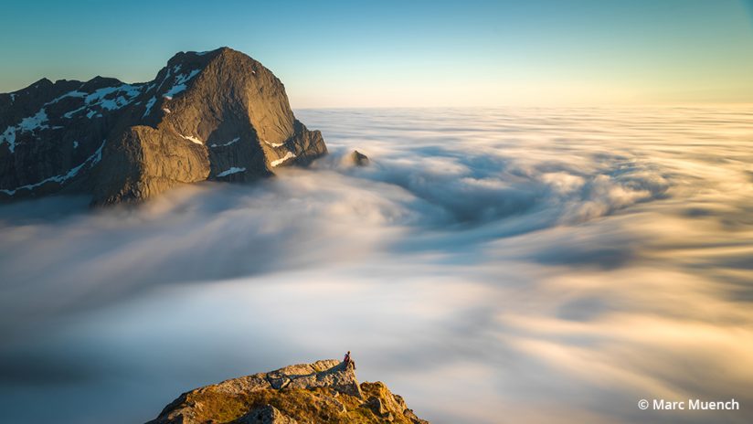
I prefer to use negative space to highlight the subject and its relative size in comparison with its surroundings. This will often give the subject the attention it needs, especially if it is small in the frame.
In the final article in this series, we’ll examine using contrast and color in landscape photography, as well as approaches to locations, representing “reality” versus artistic license, and the importance of timing.
This three-part article series is excerpted from The Art of Seeing, an ebook by Marc Muench, available as a free download at muenchworkshops.com/ebook.
The post The Art Of Seeing, Part 2 appeared first on Outdoor Photographer.

