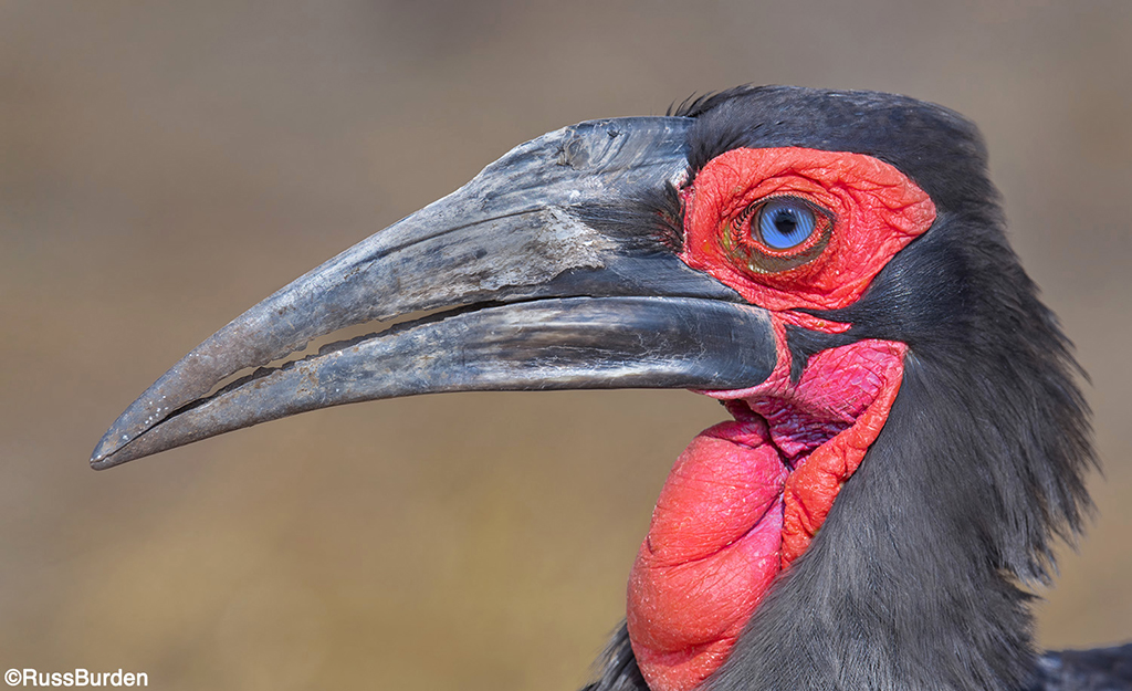
Color is powerful. It can trigger psychological responses, emotions and feelings of tranquility, anger, serenity and more. Based on the placement of a strong point of saturation, it can draw the eye to specific locations within an image. They can be soft and muted or take on opposite characteristics wherein they are bold, vivid, intense and saturated. They fall into spectrums that can soothe the mind or create movement and calamity. The strategic use of color can be critical to the mood, feeling and impact of the photo itself.

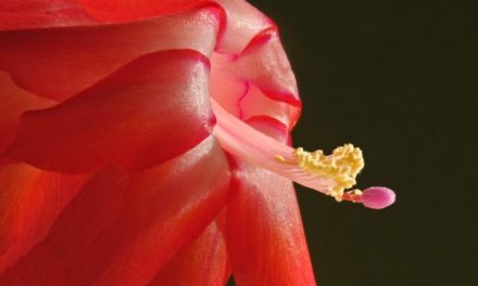
Striking, saturated and bold colors beckon viewers to notice them, while soft and muted tones fade to a whisper in comparison. Primary colors tend to be bold, while pastels tend to be the whisperers. For instance, think about placing Easter eggs on a fire engine. Although your eye would eventually spot them, what would draw you into the image would be the intense red of the truck. The pastels become secondary, although if you held the egg in the palm of your hand, the colors would be obvious.

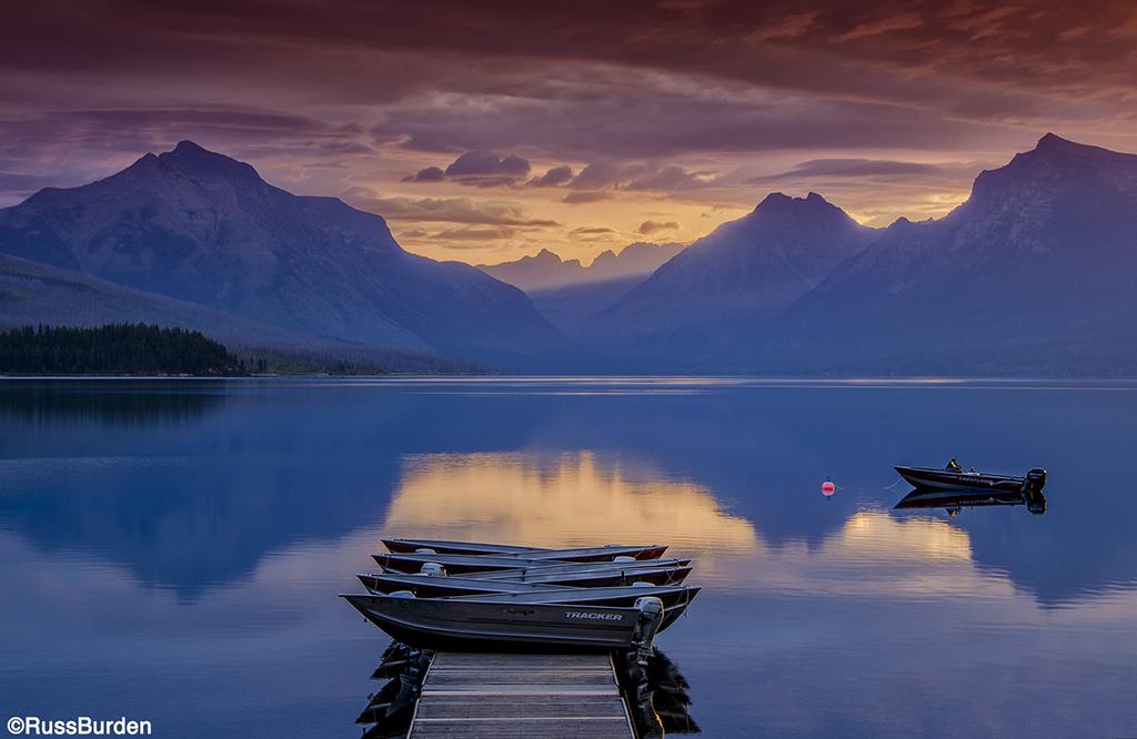
Colors fall into families—one being warmth. The warm tone family members are the reds, yellows and oranges. The opposite are the cool tone family members. They consist of blues, greens and purples. Warm tones give the illusion of coming forward in an image, while cool tones recede. This is most evidenced when a photo is made up of two colors that fall on the opposite sides of a color wheel. Think of a fall-colored yellow aspen set against a deep blue sky. The bold yellow tree pops off the page, while the sky takes a back seat in the distance. (Note the image of the fall color cottonwoods in red rock country.) Yellow and blue are opposites as are red and cyan and magenta and green.

Color is universal and needs no language to be understood. Think of a stop sign. Whether you’re driving in an English-speaking country and it reads STOP or Spanish-speaking country and it reads ALTO, the striking red octagon leaves no doubt as to what you’re required to do.

One strategic use of color is to find an offsetting pinpoint of color surrounded by an opposing hue or tone. I look for a small, brightly colored subject that pops off the page because it’s immersed in its opposite. The tiny focal point becomes the primary subject. It may take up a very small percentage of the frame, but because of its color and contrast, the eye is drawn to it first and foremost. Study images where the color grabs you and try to figure out what the photographer did to create the situation. Apply your hypothesis to your next outing and see if it works. The more you understand light and color, the more you’ll be able to create images with impact.
To learn more about this subject, join me on a photo safari to Tanzania. Visitwww.russburdenphotography.com to get more information.
The post The Strategic Use Of Color In Photography appeared first on Outdoor Photographer.


